| Author | Thread |
Comments Made During the Challenge  |
|
|
05/19/2002 09:28:00 PM |
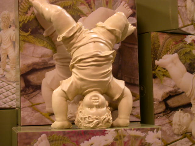
| The iamge is a little cluttered. Your subject also seems blurred/out of focus. |
|
|
|
05/19/2002 03:49:00 PM |
| The lighting on this seems a little too dark and perhaps a bit yellow. The focus on sculpture also seems a little soft -- I can't tell if that's an out of focus problem, or a lower end camera problem. I think a tighter, vertical crop would have helped focus on the statue and less on all the other things (the toes at the bottom, the other statue to the right, etc). |
|
|
|
05/16/2002 09:19:00 AM |
| I'm not sure if it's intentional, but there seems to be a slight colour cast over this picture... a very good idea though. |
|
|
|
05/16/2002 06:52:00 AM |
| Kinda freaky with the mirror image behind him that doesn't look like a mirror...The color feels a bit off to me. |
|
|
|
05/15/2002 11:22:00 AM |
| Cute. Photo 8 Creativity 6 Upsidedown 7 total 7 |
|
|
|
05/14/2002 08:15:00 PM |
| why does this seem blurry, and don' tell me you meant it that way |
|
|
|
05/14/2002 04:13:00 PM |
| great idea. vertical composition and better focus are my only recommendations. |
|
|
|
05/14/2002 11:03:00 AM |
| It's a little out of focus. |
|
|
|
05/13/2002 11:27:00 PM |
Very cute subject.
seems off-centered, and not purposed to be so, like where just his toe is cutoff
kind of blurry
|
|
|
|
05/13/2002 05:06:00 PM |
| what a trippy little dude. he's just a big freak : ) ... i like him. i wish he was in sharper focus, tho. |
|
|
|
05/13/2002 04:59:00 PM |
|
|
|
05/13/2002 01:42:00 PM |
| A little added focus here would have been a great improvement on this shot. |
|
|
|
05/13/2002 09:41:00 AM |
| Need more focus. Vertical orientation might have suited this better to remove the distracting figures on the sides. |
|
|
|
05/13/2002 02:49:00 PM |
Good find and great idea, creative work.
Sorry that it wasn't in focus. Still I like it and it's a bullseye on the topic! |
|
Home -
Challenges -
Community -
League -
Photos -
Cameras -
Lenses -
Learn -
Help -
Terms of Use -
Privacy -
Top ^
DPChallenge, and website content and design, Copyright © 2001-2025 Challenging Technologies, LLC.
All digital photo copyrights belong to the photographers and may not be used without permission.
Current Server Time: 03/13/2025 01:26:10 AM EDT.