| Author | Thread |
|
|
04/07/2003 10:52:44 PM |
Greetings from the Critique Club!...
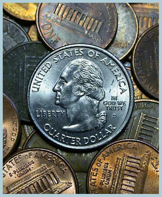
COMPOSITION... Its not the first time I've seen coin shots, dpchallenge or otherwise, but I think this is one of the ones pulled off rather well. What makes this one work, in my opinion, are the way the colors complement each other and are pleasing to the eye. The central coin is distinguished against the rest by its difference in reflectivity and color. Lighting can be difficult with objects that are highly reflective but you really brought that property out on the main coin and the background coin in the lower left. Placing coin in the center? It was the best way you could compose this picture. Placing the main coin off center would probably the focus of the image - the coin could look like it was part of the background, weakening the composition by essentially killing off one of the image's focal points. All in all, very well pulled off and your score reflects that :).
TECHNICAL... My only concern here was that you went a bit too far with sharpening your photo, unless you didn't sharpen it at all and even then, I think the photo could have benefitted from a softer look. The camera is real good at picking up every tiny imperfection in the metal. How could you legally soften the image? Perhaps mostly by placing some fine gauze-like material over the lens before shooting - stocking? An old filter smeared with vaseline would do also...perhaps some diffused lighting might help as well, if you didn't try that... If you're interested in some non-legal dpc manipulations, I tried "ortonizing" the image above with very pleasing results (duplicate image layer, gaussian blur layer with ~ radius of 25, set new layer's mode to Overlay). It saturated the colors a little more and removed some of the imperfections... Even then I found that it still showed too much of the sharpening...I flattened the image, duplicated the layer, gaussian blurred that by a radius of ~ 10... then set the layer opacity to 66%...
Anyway, always good to experiment and try stuff out!
Really loved your entry, keep it up :) |
|
Comments Made During the Challenge  |
|
|
04/06/2003 10:30:40 PM |
| It's money, sure, but your lighting and composition give it a mythical aura, making the familiar strange to me in delightful ways. Very nice. |
|
|
|
04/06/2003 09:31:23 AM |
| Nie tonal mix. central point of interest works here quite well for once. |
|
|
|
04/02/2003 10:24:27 PM |
| Nice colouring here of the various coins. Good lighting, good focus. |
|
|
|
04/02/2003 05:35:52 PM |
| Well done however IMHO I don't like to see the subject smack dab in the center. |
|
|
|
04/01/2003 08:40:59 PM |
| Great Job! Wonderful colors! |
|
|
|
04/01/2003 04:46:10 AM |
| Good DOF. The center crop works for this pic. I like the way some of the pennies are tarnished a bit, some a lot, and some not at all. Gives this a little more realism. I would've gotten a brand new shiny quarter for the picture though. Great idea. |
|
|
|
03/31/2003 04:33:59 PM |
| G. Washington. Good job. Hard to light. |
|
|
|
03/31/2003 11:20:58 AM |
| great photo! the detail is amazing. the focus looks a little soft on the word quarter, but everything else is very sharp. good job! |
|
|
|
03/31/2003 03:14:23 AM |
| Nice colours and composition. |
|
|
|
03/31/2003 02:06:25 AM |
| Nice arangement of the coins, and I really like the different colors of each one. Excellent. |
|
|
|
03/31/2003 12:53:33 AM |
| you're so close you can see the quarter's border by UNITED is thinner than on the IN GOD WE TRUST side, cool. |
|
Home -
Challenges -
Community -
League -
Photos -
Cameras -
Lenses -
Learn -
Help -
Terms of Use -
Privacy -
Top ^
DPChallenge, and website content and design, Copyright © 2001-2025 Challenging Technologies, LLC.
All digital photo copyrights belong to the photographers and may not be used without permission.
Current Server Time: 03/14/2025 02:19:45 PM EDT.