| Author | Thread |
|
|
04/08/2003 09:50:35 PM |
CC Hello franziska lang
Fits The Challenge- Yes and well.
Composition- Interest, light/shadow/style
Background-n/a
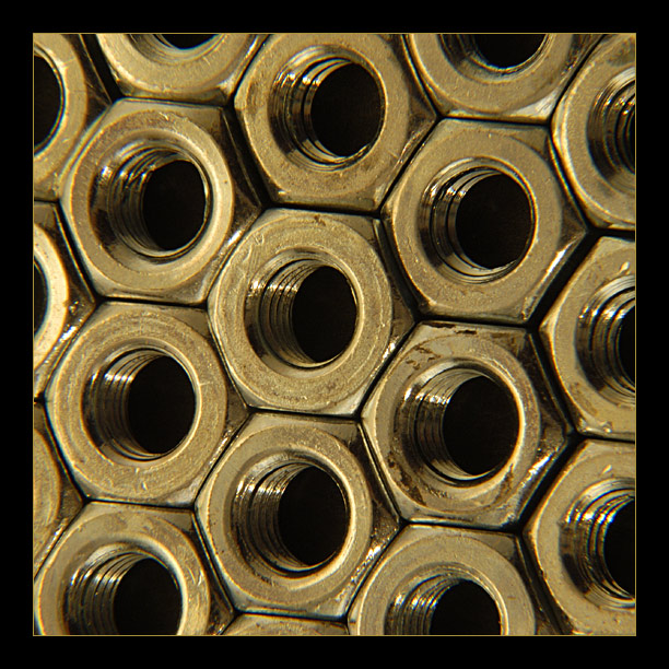
My Opinion-Lugnuts, hum never knew they could [be] stack so cool. I like this shot and think it would make a good poster. The frame takes away from the shot for me. That is about the only negative thing I can say. I like the focus, composition, perspective, the color and the light. It a keeper and you should feel good about this one.
|
|
 Photographer found comment helpful. Photographer found comment helpful. |
Comments Made During the Challenge  |
|
|
04/06/2003 03:49:27 PM |
| great macro, I think that the frame is a bit too thick, distracts from the picture....7, Anastasia |
|
| Photographer found comment helpful. |
|
|
04/06/2003 01:27:32 PM |
| Great shots are great shots. I wish there was something more to the bg than just black holes, but I'm not sure what. This would have done well in 3 or 4 challenges - it's a great shot. |
|
|
|
04/06/2003 11:10:10 AM |
| like the way you' ve got them all line up like this, good color, nice lighting, good focus too. |
|
|
|
04/06/2003 12:45:27 AM |
| I would expect to see snappier highlights from the metal surfaces. |
|
|
|
04/05/2003 06:09:14 PM |
| Like your design concept... |
|
|
|
04/04/2003 12:55:33 AM |
| excellent composition. the hexagonal lines are very strong. i think this needs a bit more light...either that or a more true silver color. it just seems too muted to me |
|
| Photographer found comment helpful. |
|
|
04/02/2003 03:30:00 PM |
| I thnk I would have called it "O nuts!" ;^) |
|
|
|
03/31/2003 04:06:00 PM |
| Cool shot. I think the frame is a negative to this. It looks formal on an industrial shot. Does that make sense. Anyway just my opinion. Good shooting. |
|
| Photographer found comment helpful. |
|
|
03/31/2003 11:17:01 AM |
| Don't think the yellow thing works (for me at least).. I was going to say you needed to correct it, but obviously that's what you're going for after seeing the yellowish border. Would have liked this in B&W or maybe slightly blue color toned to give it the cold steel look. |
|
| Photographer found comment helpful. |
|
|
03/31/2003 09:45:03 AM |
| very nice study of patterns here.. the only improvement i could suggest woudl be either going to black and white or making some white balance adjustments to remove the yellow tint.... nice work though :) - setzler |
|
| Photographer found comment helpful. |
|
|
03/31/2003 05:31:14 AM |
Nice image. Well conceived, well setup, nicely captured. I don't like how the nuts look a little dull, like they were tarnished, but a great shot. - 9
|
|
| Photographer found comment helpful. |
|
|
03/31/2003 03:21:30 AM |
| Very nice composition and lighting. Wouldn't change much here. Well done. |
|
Home -
Challenges -
Community -
League -
Photos -
Cameras -
Lenses -
Learn -
Help -
Terms of Use -
Privacy -
Top ^
DPChallenge, and website content and design, Copyright © 2001-2025 Challenging Technologies, LLC.
All digital photo copyrights belong to the photographers and may not be used without permission.
Current Server Time: 03/14/2025 04:59:25 PM EDT.