| Author | Thread |
Comments Made During the Challenge  |
|
|
04/25/2005 10:37:04 PM |
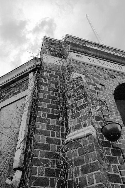
| From the title, I would guess you want the subject to look more old ?? In that case increase teh saturation a bit, make the bricks look old ... try duoton on this one with black and another shade of gray.. something like process coated 325-2 |
|
 Photographer found comment helpful. Photographer found comment helpful. |
|
|
04/23/2005 01:45:59 PM |
| I don't get the title and the photo subject is not very compelling |
|
| Photographer found comment helpful. |
|
|
04/21/2005 09:14:20 PM |
|
| Photographer found comment helpful. |
|
|
04/21/2005 08:00:29 PM |
| nice work, great perspective. really love how all the lines and angles work with the vines. great tones, as well. good luck! |
|
| Photographer found comment helpful. |
|
|
04/19/2005 11:05:32 PM |
| Think we needed to see more of the building to give a good opinion. This just seems a bit bland. Also the empty planter doesn't really add much. ? |
|
| Photographer found comment helpful. |
|
|
04/19/2005 08:11:07 AM |
| I think this image could use some contrast, it seems a little bit flat. Looks like a good shot to practice dodging and burning on! ;) |
|
| Photographer found comment helpful. |
Home -
Challenges -
Community -
League -
Photos -
Cameras -
Lenses -
Learn -
Help -
Terms of Use -
Privacy -
Top ^
DPChallenge, and website content and design, Copyright © 2001-2025 Challenging Technologies, LLC.
All digital photo copyrights belong to the photographers and may not be used without permission.
Current Server Time: 03/18/2025 02:32:15 PM EDT.