| Author | Thread |
|
|
04/13/2003 05:54:58 PM |
Greetings from the Critique Club
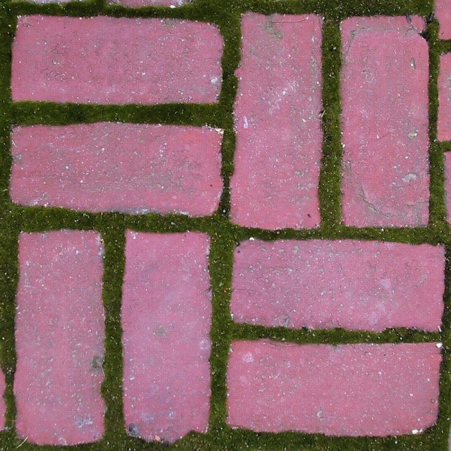
No question here about whether this fits the Symmetry challenge. It's clear that it does. Compositionally this looks almost Warhol-esque or perhaps even a fabric print. It's a very brash collection of shapes when photographed up close like that, filling the frame. That boldness could have been used more to your advantage, I think, by playing with the colours more and perhaps making them equally brash. It is, I think, the colours that let this image down a little. You've taken an everyday household object and photographed it in a way that we wouldn't normally see. You've managed to disassociate your image quite strongly from the original scene very successfully and I'd have liked to have seen you sever the link entirely by not attempting to keep the original colours. The bricks have come out a little purple-looking and the light is very flat. That really brings down this otherwise in your face image.
Technically your image is just fine. The focus seems OK if bordering a little on the soft side - I dont think that's a problem. The exposure is OK but the whole scene could have used a lot more light. I've already covered composition and that's your strongest element here.
I think your concept was good - you went out with an idea in mind and you captured it well. I just think you needed to develop that idea a little more to turn it into something that really stands out. |
|
 Photographer found comment helpful. Photographer found comment helpful. |
Comments Made During the Challenge  |
|
|
04/04/2003 01:45:59 PM |
| Creative image and good focus. This image seems a little bit boring to me. I think it may need something else maybe in front, and then use the bricks as the background. Good job. |
|
| Photographer found comment helpful. |
|
|
04/04/2003 11:47:27 AM |
| Simple, but effective. I'd like to see this solarized. Might be cool. |
|
| Photographer found comment helpful. |
|
|
04/02/2003 12:17:38 PM |
| I like the softness of this image. The moss growing between the bricks is so nice here. I also enjoy the soft communication of symmetry this image evokes. |
|
| Photographer found comment helpful. |
|
|
04/01/2003 02:15:49 PM |
| nice clear image, good idea |
|
| Photographer found comment helpful. |
|
|
04/01/2003 12:43:56 AM |
| I enjoy the simple things. |
|
| Photographer found comment helpful. |
|
|
03/31/2003 01:52:18 PM |
| I like the texture of this photo. |
|
| Photographer found comment helpful. |
Home -
Challenges -
Community -
League -
Photos -
Cameras -
Lenses -
Learn -
Help -
Terms of Use -
Privacy -
Top ^
DPChallenge, and website content and design, Copyright © 2001-2025 Challenging Technologies, LLC.
All digital photo copyrights belong to the photographers and may not be used without permission.
Current Server Time: 03/12/2025 03:48:37 PM EDT.