| Author | Thread |
Comments Made During the Challenge  |
|
|
04/25/2005 09:08:29 PM |
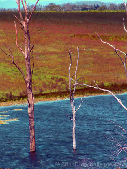
| i'm not quite sure what happened here, but this really seems over-processed. it has a very unnatural feel to it. i could accept it as intentional if the subject matter was a bit more griping, but, as it is, i'm kinda lost. hope this does well for you. good luck! |
|
|
|
04/25/2005 05:21:12 PM |
| This looks a little over-processed |
|
|
|
04/25/2005 01:23:40 PM |
| Looks a little noisy and the subject doesn't do much for me. |
|
|
|
04/24/2005 02:19:40 PM |
| colors are really bad / poor focus |
|
|
|
04/24/2005 12:41:00 PM |
| To be honest, the colors and spotchiness just aren't doing it forme... |
|
|
|
04/24/2005 05:47:35 AM |
| no strong subject, but colours are great |
|
|
|
04/24/2005 02:21:22 AM |
| colors are way too far away from natural |
|
|
|
04/23/2005 12:08:43 PM |
| Overprocessed because the photo has no crispness and the colors seem unnatural. |
|
|
|
04/23/2005 08:30:52 AM |
| The colors seem a little odd and oversaturated unless you were going for a surreal photo-art effect, which isnt always easy to know. It looks like it was harsh light and so the image is a little flat also. The photo quality isnt really that good, sorry. |
|
|
|
04/22/2005 09:20:25 PM |
| Colors are not right here. |
|
|
|
04/20/2005 08:56:19 PM |
| Weird colors in this image. |
|
|
|
04/19/2005 07:57:11 PM |
colour looks over saturated and image looks over sharpened. May be my eyes :)
good luck though |
|
|
|
04/19/2005 02:25:21 PM |
| Your colors look a bit off (unreal) and the composition is a bit boring. |
|
|
|
04/19/2005 01:44:21 PM |
| This is more digital art than photography for me. Sorry! |
|
|
|
04/19/2005 12:26:17 AM |
| not very clear. i don't know if it was intended like that, but i didn't find it interesting. |
|
Home -
Challenges -
Community -
League -
Photos -
Cameras -
Lenses -
Learn -
Help -
Terms of Use -
Privacy -
Top ^
DPChallenge, and website content and design, Copyright © 2001-2025 Challenging Technologies, LLC.
All digital photo copyrights belong to the photographers and may not be used without permission.
Current Server Time: 03/16/2025 05:11:50 AM EDT.