This image came up for me last night, and I have pondered it all day on what to say that could have made this photo more visually appealing to me. I am glad I waited to comment, as I can now see your comments and how you feel about your image and placing.
My first advice is to not give up. A free study challenge is a tough one to get a score in, and actually, you got a 4.3, which isn't that bad. If we were told how to vote (guidelines) then there would be no point in voting at all. I think the voting is done a lot on visual appeal, which, if you were going to buy something to hang in your livingroom, wouldn't you chose something you liked? Isn't it possible to like something that's not technically perfect? Is it possible to hate something that IS technically perfect? I think so. It's all about opinion. And for the photos that are going in your album, the only opinion that matters is yours. However, if you are looking to improve your photography to be appealing to the masses, then use this as a good learning tool. Why would you want to appeal to the masses? Some people sell photos, some are pet photographers, some are wedding photographers, some take event photos, some take pics for magazines or newspapers. For those shots, the photo needs to appeal to the masses. That is what this site is for. A learning tool to improve your photography to appeal to the masses.
Ok, now on to your photo.
This critique is how this photo could be improved to make it more visually appealing to ME, and ME only.
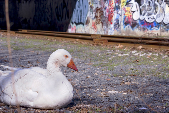
The very first thing I notice about the photo is that the goose is a little soft in focus. My eyes want to see some crisp feathers or maybe a little detail in his face. The background is also blurred, which is good in my opinion, however, the combination of the soft focus on the goose and the soft focus of the background gives the overall photo the feeling of being out of focus. Oddly enough though, looking at the photo, the ground in front of the goose is in focus. This could be because the goose is white and the light shining on him is making him look soft. I might have used a deeper DOF for this just to insure that the ground and the goose were in crisp focus.
The upper left corner is quite dark in comparrison to the rest of the photo due to the shadow and that is a bit of a distraction from the bright white goose. The photo is very 'left side' heavy and that also draws away from the grafitti as well.
2 things that I like about the photo are the nice placement of the strong diagonal within the frame of the photo. I like how you did not place it running directly through the center of the photo, but rather to the upper half. That to me is visually appealing and creates nice movement. That movement is halted though with the dark upper left corner.
Second thing I like is how the goose seems so out of place. He could be called Ghetto Goose. Definately something you (or at least I) don't see every day.
The out of focus stick going through the image is also distracting. In my opinion it does not add anything to the image, and would better lead the eyes to the goose had it not been there. That being said, I realize that you may not have been able to move it, but non the less, it would be a stronger image in my opinion without it.
That's about it. Just one more persons opinion. Sorry for the long winded post, please don't get discouraged with the site, and remember...take photos for yourself.
~Heather~
EDIT: I want to add that I looked at your blog site linked in your portfolio and the first photo on there of the Ghetto Goose is a 'wow'. If I had to pick between the 2, I personally would have chosen the other one. There's just something about it that has a lot of appeal to me. You have very nice photos, don't give up here.
Wow, talk about an ego buster. I'm not sure I'm up for another round of this. I understand that people may not have shared my vision here but I do not think this photo warranted the placement (in the 4th percentile of all entries) I got. It's a good thing that I know I have talent--and I'll admit this in not my best photo ever, so be it. I guess what really gets under my skin is that there do not seem to be guidelines for voting. Although people may not like the goose, the graffiti, whatever, I do think it was better than some of the photos that scored higher than mine. I feel like the DP audience in very diverse, from pros to amatuers, and with that comes some very different ways of looking at and judging photos. For instance, when I judge a photo, I first look at the difficulty of the shot (for the record, my was not difficult or complex), the composition or intended composition, all while disregarding my personal opinions of the subject matter. This is not the case with most I've found. There are photos out there that are 'crowd pleasers' and receive high scores but are technically weak, totally over done in post-production, and safe, boring shots. All that said, I don't think this photo should have won, or even scored much higher, my real beef is with the process.
almost surreal! goose looks a bit unhappy though! nice shot, i like it that the BG is slightly out of focus, draws my eye to the goose all the more. Good stuff
i hope you are getting some good and useful comments on your entry. i am sure there are some things that could be done to improve the image from a technical standpoint, but i don't think 'technical' is what is holding your score back. while it does get your attention, it doesn't really keep it.
As a subject, the goose is cropped off-screen. This is a bit distracting. There also seems to be a focus problem in this image. the goose isn't sharp, and the entire background is soft was well. You may also notice the stick which is out of focus on the left. As it crosses through the subject, it creates another distraction.