| Author | Thread |
Comments Made During the Challenge  |
|
|
05/26/2002 11:19:00 AM |
|
|
|
05/26/2002 01:42:00 AM |
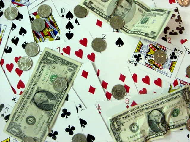
| I like the business of this scene, it fits. I think it could use more contrasty lighting with darker shadows. |
|
|
|
05/26/2002 12:07:00 AM |
| Makes me very nostalgic for my regular Wednesday night poker game in Queens, NY, many years ago. Great capture. Love the cropping. |
|
|
|
05/25/2002 07:58:00 PM |
|
|
|
05/24/2002 10:37:00 PM |
| Interesting idea, too many cards on the table tough, would have liked it better with the money in a pile and maybe a hand or two of cards being the only showed. Also the "soft" focus is a little distracting. |
|
|
|
05/24/2002 09:56:00 AM |
| Focus could have been better. |
|
|
|
05/23/2002 09:58:00 PM |
| to out of focus it makes it hard to look at I would have tried a better contrast of colors..but great effort |
|
|
|
05/23/2002 08:36:00 AM |
| out of focus. this photo is rather boring, i dont think the cards make a good background and the money on top just doesnt do anything for me. a better idea might have been a pile of money on a table with a hand of cards in view. |
|
|
|
05/22/2002 09:56:00 PM |
|
|
|
05/22/2002 07:32:00 PM |
| I think some shinier coins may have improved the impact here... I would also like it a little more photographed from an angle rather than from directly overhead... good job! |
|
|
|
05/22/2002 02:56:00 PM |
| I think this would of worked better if it showed an actual poker hand with money next to it to make it look more like the game play of poker. |
|
|
|
05/21/2002 06:07:00 PM |
| Your pictures seems to be a tad out of focus and it looks like maybe you had too much jpeg compression going on. Your file is only 80+kb and you have a maximum of 150kb to work with. Try saving this at a higher resolution. The picture also seems to be a bit to crazy. There is too much going on. I would have prefered if you would have narrowed your subject down, maybe putting the cards in a stack with a pile of money next to it. |
|
|
|
05/21/2002 05:01:00 PM |
| Perhaps if this looked like a poker game it would have sold this a little better, sorry just seems somewhat unorganized. |
|
|
|
05/21/2002 04:46:00 PM |
| focus looks a little out, good colourful subject |
|
|
|
05/21/2002 04:06:00 PM |
| Nice pic... a little off focus though? Or intentional? Nice eitherway... |
|
|
|
05/21/2002 02:26:00 PM |
| I see the cards and money, but I have to admit I wouldn't immediately think Poker without the title -- gambling maybe. There are an awful lot of compression artifacts -- and I notice your file size is about half what it could be. You might want to save at a higher resolution. The focus on this could also be a little sharper, and the color seems to have something of a green tint -- as if you shot under florescent lighting. Try a levels fix in your image editing program. |
|
|
|
05/21/2002 12:05:00 PM |
| The money seems out of foucs on my screen. |
|
|
|
05/20/2002 04:53:00 PM |
|
|
|
05/20/2002 03:57:00 PM |
| Did you make that $5 on your HP? |
|
|
|
05/20/2002 01:25:00 PM |
| This is a fine idea and a good try. I would of liked the cards more disorganized, a little too staged here. Money [paper] is all right side up. It's not bad at all! |
|
|
|
05/20/2002 12:49:00 PM |
| Seems too scattered/cluttered to have any large effect. I think a nice stack of cards, a nice stack of cash, and a few stacks of change would've have a larger effect. |
|
|
|
05/20/2002 10:41:00 AM |
| This looks oversharpened, and also doesn't invoke "poker" with me w/out reading the title. Maybe a hand of cards and the money in the pot in the middle would've been better. |
|
|
|
05/20/2002 09:34:00 AM |
|
|
|
05/20/2002 08:05:00 AM |
| last i checked, this is not how poker is played. |
|
Home -
Challenges -
Community -
League -
Photos -
Cameras -
Lenses -
Learn -
Help -
Terms of Use -
Privacy -
Top ^
DPChallenge, and website content and design, Copyright © 2001-2025 Challenging Technologies, LLC.
All digital photo copyrights belong to the photographers and may not be used without permission.
Current Server Time: 03/12/2025 10:18:30 PM EDT.