| Author | Thread |
Comments Made During the Challenge  |
|
|
05/03/2005 05:31:02 PM |
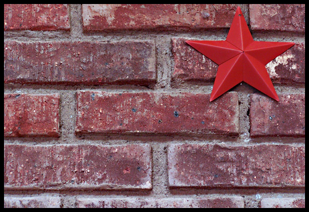
| I would have chosen a blue star, not for any photographic reason, but rather the fact that you can get them for a bit cheaper than the red one. |
|
 Photographer found comment helpful. Photographer found comment helpful. |
|
|
05/02/2005 11:06:10 PM |
| There just seems to be too much detail in elements (bricks) that are not the focus of the shot. 4 |
|
| Photographer found comment helpful. |
|
|
04/30/2005 01:00:00 PM |
| Interesting idea, works well, love the textures, but is the ISO too high, or is it my eyes from the last few photos? nice colours too, lose the border though, one point lost, 4 |
|
| Photographer found comment helpful. |
|
|
04/30/2005 12:03:11 PM |
| great use of the topic at hand, I commend you. There seems to be a blueish tint to the image, perhaps a slide of the cursor would take that cast out. Good job regardless, 7 |
|
| Photographer found comment helpful. |
|
|
04/29/2005 11:22:08 AM |
|
| Photographer found comment helpful. |
|
|
04/27/2005 09:27:26 AM |
| A difficult image to comment on really, it has simplicity and is minimal, but the elegance I associate with minimalism is lacking |
|
| Photographer found comment helpful. |
|
|
04/27/2005 07:49:28 AM |
|
|
|
04/27/2005 01:06:01 AM |
| I really like the backdrop. Nice selection. I'd personally prefer to find the star placed a little more naturally, though. It seems too blatantly forced to the edge, to me. But that's all I can find for critique because I love the photo. Colour selection is tops. |
|
| Photographer found comment helpful. |
Home -
Challenges -
Community -
League -
Photos -
Cameras -
Lenses -
Learn -
Help -
Terms of Use -
Privacy -
Top ^
DPChallenge, and website content and design, Copyright © 2001-2025 Challenging Technologies, LLC.
All digital photo copyrights belong to the photographers and may not be used without permission.
Current Server Time: 03/12/2025 04:08:59 PM EDT.