| Author | Thread |
|
|
04/18/2003 07:14:58 AM |
Greets from the Critque Club:
Hi there Fiver!
Initial Impression:
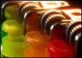
Colorful, A bit too processed for my tastes.
Challenge:
Certainly meets the challenge
Compostion:
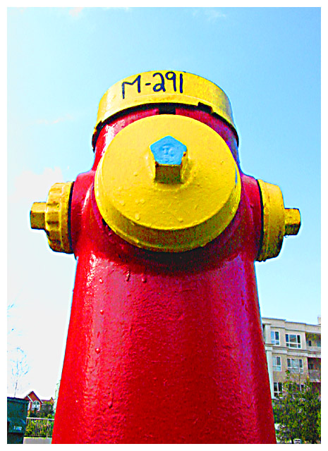
This is rather weak in my opinion, but I'm not sure there's much you could do to improve it. For your subject and the surroundings it's decent. Maybe some clouds in the sky would have helped add some interest to the photo.. Not sure really.
Technical/Post-Processing:
This was the first thing I noticed about this pic.. The colors are very vivid and sharp, making the subject look fake. From your comments I can see that's what you intended and you succeeded well. However, from a score standpoint really manipulated photos tend not to do well here.
Overall:
Good job in achieving the affect you desired! Good luck in future challenges and don't let low scores stop you from developing your style.
-Matt |
|
 Photographer found comment helpful. Photographer found comment helpful. |
Comments Made During the Challenge  |
|
|
04/13/2003 06:33:06 PM |
| The blue on the "water god" matches the blue of the sky nicely. |
|
| Photographer found comment helpful. |
|
|
04/13/2003 12:02:18 AM |
| You can tell this photo was manipulated. The background is distracting. |
|
|
|
04/12/2003 07:26:52 AM |
| Nice perspective. Would be more effective if we wouldn't see the buildings in the background, though this almost impossible in a city setting. Good luck. |
|
| Photographer found comment helpful. |
|
|
04/12/2003 12:58:57 AM |
| Interesting subject and colours but I think it's over saturated. |
|
| Photographer found comment helpful. |
|
|
04/11/2003 08:04:53 PM |
| Wonderful perspective and color. The background stuff is too distracting. :( I wish that you could have gotten a litttttttttle lower and only had sky in the pic. :) |
|
| Photographer found comment helpful. |
|
|
04/11/2003 01:35:21 AM |
| i like the angle. kind of reminds me when I was a dog in a previous life |
|
| Photographer found comment helpful. |
|
|
04/09/2003 05:02:30 PM |
| Way too much sharpening or color saturation but I like the subject. |
|
| Photographer found comment helpful. |
|
|
04/09/2003 03:13:20 PM |
| great - except for the appartment buildings in the background - wish you'd found an angle that didn't show them. |
|
| Photographer found comment helpful. |
|
|
04/09/2003 02:30:36 PM |
| Nice image and good colors. I like how you made the hydregent prodominant in the photo. Good job. |
|
| Photographer found comment helpful. |
|
|
04/09/2003 11:10:36 AM |
|
|
|
04/08/2003 06:24:37 PM |
|
| Photographer found comment helpful. |
|
|
04/08/2003 05:38:41 PM |
| Makes a guy want to raise a leg. NIce.8 |
|
| Photographer found comment helpful. |
|
|
04/08/2003 04:41:18 PM |
|
| Photographer found comment helpful. |
|
|
04/08/2003 02:17:20 PM |
|
| Photographer found comment helpful. |
|
|
04/08/2003 02:16:24 PM |
|
| Photographer found comment helpful. |
|
|
04/08/2003 12:36:43 AM |
| This is really good. I think it looks a little washed out on the lower left side. A good submission for color. |
|
| Photographer found comment helpful. |
|
|
04/07/2003 07:21:22 PM |
| A little over-saturated (see the color bleeding off the purple and cyan?). Nice shot however, I like the bold subject. |
|
| Photographer found comment helpful. |
|
|
04/07/2003 12:25:40 AM |
| Very kool perspective....really good. |
|
| Photographer found comment helpful. |
Home -
Challenges -
Community -
League -
Photos -
Cameras -
Lenses -
Learn -
Help -
Terms of Use -
Privacy -
Top ^
DPChallenge, and website content and design, Copyright © 2001-2025 Challenging Technologies, LLC.
All digital photo copyrights belong to the photographers and may not be used without permission.
Current Server Time: 03/12/2025 11:46:26 AM EDT.