| Author | Thread |
|
|
04/26/2003 06:17:15 PM |
|
|
|
04/16/2003 01:15:39 AM |
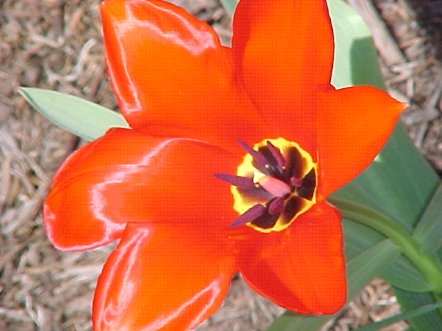
Oh! You're one of those members that I've been wondering about. There seem to be a few who almost always have school shots, and I've wondered if maybe you're sharing a school camera or something.
Anyway, this fits the challenge.
First impression is WOW. This is bright! It's sort of too bright and brash. The dof really helps the flower stand out.. but it stands out enough. Maybe too much saturation. I think you needed someone to shade the sun so that it isnt in direct light. Exposure is actually decent for such bright light though. I like the angle.
If possible, post the aperture and shutter speed with your entries. It helps others learn and helps with critiques.
It also seems like maybe you had soft focus and then oversharpened. Something about the edges is just a bit weird.
ANYWAY, decent shot with a few technical problems. Good color. Keep learning! |
|
Comments Made During the Challenge  |
|
|
04/12/2003 12:11:03 PM |
| Nice colors. Too bad there isn't more definition within the flower. This might be a result of too much flash or sun. |
|
|
|
04/11/2003 01:15:27 AM |
| pretty, too edited for my taste |
|
|
|
04/09/2003 06:00:02 PM |
|
|
|
04/09/2003 05:29:23 PM |
| Just a bit of over saturation that is evident in the upper right petal contrasting against the lighter green. Nice picture anyway. |
|
|
|
04/09/2003 10:17:29 AM |
|
|
|
04/08/2003 05:02:42 PM |
| interesting optical illusion (intentional?) effect ... |
|
|
|
04/08/2003 02:09:14 PM |
|
|
|
04/08/2003 01:58:26 PM |
|
|
|
04/08/2003 02:02:37 AM |
| Cool velvety color. It would look nicer if the highlights went around to the other side, but then again you can't have erverything right? |
|
|
|
04/07/2003 10:13:11 PM |
| Background could be more out of focus. |
|
|
|
04/07/2003 01:51:51 PM |
|
|
|
04/07/2003 01:08:17 PM |
| The sheen on the pedels is beautiful. This might have been better if 1.give the pedels more room to breath or 2.more abstract focusing on either the center of the flower or on the sheen of the pedels. But very nice photo |
|
Home -
Challenges -
Community -
League -
Photos -
Cameras -
Lenses -
Learn -
Help -
Terms of Use -
Privacy -
Top ^
DPChallenge, and website content and design, Copyright © 2001-2025 Challenging Technologies, LLC.
All digital photo copyrights belong to the photographers and may not be used without permission.
Current Server Time: 03/12/2025 03:20:09 PM EDT.