| Author | Thread |
Comments Made During the Challenge  |
|
|
05/03/2005 01:32:43 PM |
| great, would have done well in abandoned buildings, 8 |
|
 Photographer found comment helpful. Photographer found comment helpful. |
|
|
05/03/2005 05:29:25 AM |
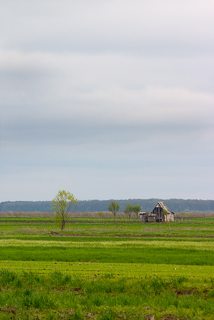
| You've got a nice idea here. This scene, the little house fits the challenge nicely IMO, and seems kind of pleasantly photogenic. I'm thinking there is a little too much foreground though. Maybe cropping a bit off the bottom might make for a much stronger presentation. Perhaps cutting it off just below the largest tree at left. I think this would make it not only even better for the challenge, but perhaps even better as just a photo in general. |
|
| Photographer found comment helpful. |
|
|
04/30/2005 06:56:49 PM |
| Nice colors. The tree in the foreground draws my eye away from the house. Maybe a different angle or point of view would help. 6 |
|
| Photographer found comment helpful. |
|
|
04/30/2005 10:34:36 AM |
| Great vivid green in this picture, makes the house look older and gives the image more style :-) |
|
| Photographer found comment helpful. |
|
|
04/30/2005 08:03:38 AM |
|
| Photographer found comment helpful. |
|
|
04/30/2005 01:05:40 AM |
| the old house is challenged by the green grass. with less forground, the focus would be more on the building. |
|
| Photographer found comment helpful. |
|
|
04/29/2005 10:28:47 PM |
| this would have been nice for the abandoned buildings contest, well done |
|
| Photographer found comment helpful. |
|
|
04/29/2005 05:47:59 PM |
| Gorgeous pastels, looks very spring like. Too bad this was a basic editing challenge, the texture in the sky could use a little tweeking in levels. Overall a nicely done photo and meets the challenge very well |
|
| Photographer found comment helpful. |
|
|
04/29/2005 02:23:07 PM |
| Leading lines of budding trees add wonder to this photo. Lovely! |
|
| Photographer found comment helpful. |
|
|
04/29/2005 03:06:27 AM |
| Hey, this looks like it would've worked for abandoned buildings. |
|
| Photographer found comment helpful. |
|
|
04/28/2005 01:32:49 AM |
| nice intesity green with the sky had a similar intense blue in it |
|
| Photographer found comment helpful. |
|
|
04/27/2005 08:58:28 PM |
| Nice frame-up although the colors are bland looking |
|
| Photographer found comment helpful. |
|
|
04/27/2005 06:20:17 PM |
| Good try, but the image does not grab me. It does have a good sence of depth |
|
| Photographer found comment helpful. |
|
|
04/27/2005 05:21:26 PM |
| Nice photo, but the overcast skies are not interesting. Is the focus really on the house, or are my eyes hurting from voting in this minimalism challenge, trying to find the subjects? Maybe a better crop to coorespond with the rule of thirds?Good try, 5 |
|
| Photographer found comment helpful. |
|
|
04/27/2005 02:31:16 PM |
| Very nice. A little less foreground would give the subject a little more punch and add a bit more drama to the scene. |
|
| Photographer found comment helpful. |
|
|
04/27/2005 01:08:53 PM |
| Nice scene, but I find the sky a bit boring. |
|
| Photographer found comment helpful. |
Home -
Challenges -
Community -
League -
Photos -
Cameras -
Lenses -
Learn -
Help -
Terms of Use -
Privacy -
Top ^
DPChallenge, and website content and design, Copyright © 2001-2025 Challenging Technologies, LLC.
All digital photo copyrights belong to the photographers and may not be used without permission.
Current Server Time: 03/12/2025 06:30:58 PM EDT.