| Author | Thread |
|
|
05/04/2005 07:35:05 AM |
| this is great for the challenge, never voted on this one. |
|
 Photographer found comment helpful. Photographer found comment helpful. |
|
|
05/04/2005 07:14:53 AM |
| This is definitely an underrated shot. |
|
| Photographer found comment helpful. |
Comments Made During the Challenge  |
|
|
05/03/2005 11:02:13 PM |
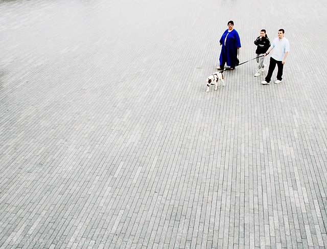
| I like the placement of the people, the lines and texture of the ground, and the high contrast of the people. 7 |
|
| Photographer found comment helpful. |
|
|
05/03/2005 11:01:43 PM |
| Nice lines created by the stones on the ground. |
|
| Photographer found comment helpful. |
|
|
05/03/2005 06:46:03 PM |
| What a great shot easy 10 |
|
| Photographer found comment helpful. |
|
|
05/03/2005 02:16:53 PM |
| Very good! Very diff then ither entries too. Well done! One of my favs |
|
| Photographer found comment helpful. |
|
|
05/03/2005 01:37:18 PM |
| woman looking up is distracting, if the dog is the focus of the picture, also, it looks like you're trying to force contrast out of the picture that isn't there, so it looks over-processed. i think i would have really liked it if the woman wasn't even there, but maybe you couldn't control that |
|
| Photographer found comment helpful. |
|
|
05/03/2005 05:52:02 AM |
| LOL :O) love the title for the shot. The background is great there is no rubbish to discract the eye, and works well. |
|
| Photographer found comment helpful. |
|
|
05/03/2005 12:20:47 AM |
| The texture in the bricks seems to wash out near the back of the image, and the focus gets a bit soft near the people as well. Nice use of negative space. |
|
| Photographer found comment helpful. |
|
|
05/02/2005 11:21:38 PM |
|
| Photographer found comment helpful. |
|
|
05/02/2005 06:52:39 PM |
| great picture, nice composition and fits the challenge 8 |
|
| Photographer found comment helpful. |
|
|
05/01/2005 08:59:00 PM |
Very nice job and I love your title! 7
|
|
| Photographer found comment helpful. |
|
|
05/01/2005 04:58:36 PM |
| nice shot, a good subject very well done |
|
| Photographer found comment helpful. |
|
|
05/01/2005 03:44:44 PM |
| Excellent excellent title! ...it gives a sense of "urgency" to this picture. |
|
| Photographer found comment helpful. |
|
|
05/01/2005 02:25:52 PM |
|
| Photographer found comment helpful. |
|
|
05/01/2005 03:27:31 AM |
| Good shot... however I'm first drawn to the people in the picture. I see the dog mostly because of the title... 6. |
|
| Photographer found comment helpful. |
|
|
04/30/2005 11:57:53 PM |
| hahaha. this rocks! One of my favorites so far. |
|
| Photographer found comment helpful. |
|
|
04/30/2005 10:52:28 AM |
| Nice capture (and funny title too). |
|
| Photographer found comment helpful. |
|
|
04/30/2005 10:27:46 AM |
Very cool effect on this, I just can't place my finger on it... Maybe you made a very large unsharp mask?
Whatever it is, it works, man (or woman) |
|
| Photographer found comment helpful. |
|
|
04/29/2005 10:40:54 PM |
| good image LOL! on the title |
|
| Photographer found comment helpful. |
|
|
04/29/2005 11:59:44 AM |
| Typo in title intentional ? |
|
| Photographer found comment helpful. |
|
|
04/29/2005 10:08:27 AM |
| nice lines, good neg. space, whites barely in, good blacks., nice movement |
|
| Photographer found comment helpful. |
|
|
04/29/2005 05:24:29 AM |
| Nice photo, imagine how many bricks there must be, good luck |
|
| Photographer found comment helpful. |
|
|
04/29/2005 04:03:43 AM |
| This is my pick for a ribbon well done 10 |
|
| Photographer found comment helpful. |
|
|
04/29/2005 03:50:53 AM |
| Haha! I love it! So funny and well executed too. A 9 from me. |
|
| Photographer found comment helpful. |
|
|
04/29/2005 02:29:22 AM |
|
| Photographer found comment helpful. |
|
|
04/28/2005 10:17:27 PM |
|
| Photographer found comment helpful. |
|
|
04/28/2005 11:08:31 AM |
| I like this -- it has the simplicity that many of the others are missing. God Luck! |
|
| Photographer found comment helpful. |
|
|
04/28/2005 11:06:41 AM |
| Perfect! Super blend of interesting background and common subject, to make an overall interesting photo. |
|
| Photographer found comment helpful. |
|
|
04/27/2005 10:39:42 PM |
| Nice, fits the challenge pretty well I think. |
|
| Photographer found comment helpful. |
|
|
04/27/2005 08:30:08 PM |
| Hilarious title, i love the tiles, the colors, etc. Good one! |
|
| Photographer found comment helpful. |
|
|
04/27/2005 07:27:56 PM |
| excellent use of ground "lines" - maybe would have gone with a single person with the dog for more compact subject. I like it. |
|
| Photographer found comment helpful. |
|
|
04/27/2005 05:52:16 PM |
| Great POV. The white shirt is a bit overexposed,and I'd darken the whole picture, but this is a REALLY nice shot. |
|
| Photographer found comment helpful. |
|
|
04/27/2005 05:51:15 PM |
| I LOVE this one!!! Meets the challenge perfectly. The brick/stone walkway adds interest without being overly busy or too plain. |
|
| Photographer found comment helpful. |
|
|
04/27/2005 05:23:47 PM |
| Like this idea, maybe, looks a we washed out though. |
|
| Photographer found comment helpful. |
|
|
04/27/2005 12:59:14 PM |
| Very very nice, this is one of the better shots I have seen so far but just starting out the voting, I like it and gave it an 8, I especially like the distortion from no doubt a wide angle lens and the effect it has on the pattern in the gound. One other thing, sorry for saying this but IMHO but the title of the shot is as bad as this shot is good, couldn´t you think of anything better...? :o) |
|
| Photographer found comment helpful. |
|
|
04/27/2005 10:28:29 AM |
| to me the woman in blue coat is the strong point not the dog. a bit too much bright white. washes out any detail there |
|
| Photographer found comment helpful. |
|
|
04/27/2005 10:18:42 AM |
| nice with the bricks and interesting people 9 |
|
| Photographer found comment helpful. |
|
|
04/27/2005 09:54:53 AM |
| Very funny. The seemingly endless woodwork decking works well for this photo. The subjects are perfectly placed, and the colors of the clothing work perfectly. I'd prefer it if the photographer seemed a little more invisible - if the subjects' gazes all were parallel with the dog's. Nice shot. |
|
| Photographer found comment helpful. |
|
|
04/27/2005 08:27:34 AM |
LOL well done
nice perspective
|
|
| Photographer found comment helpful. |
|
|
04/27/2005 06:44:47 AM |
|
| Photographer found comment helpful. |
|
|
04/27/2005 12:09:22 AM |
|
| Photographer found comment helpful. |
Home -
Challenges -
Community -
League -
Photos -
Cameras -
Lenses -
Learn -
Help -
Terms of Use -
Privacy -
Top ^
DPChallenge, and website content and design, Copyright © 2001-2025 Challenging Technologies, LLC.
All digital photo copyrights belong to the photographers and may not be used without permission.
Current Server Time: 03/12/2025 02:41:57 PM EDT.