| Author | Thread |
Comments Made During the Challenge  |
|
|
04/30/2005 02:46:14 PM |
| The lighting on the left side of the image is creating a distinct line on the edge of the watch and band. This is very distracting from the image overall. Watch face is too blurry and the lettering looks odd as it has lines and background noise in or near it. |
|
 Photographer found comment helpful. Photographer found comment helpful. |
|
|
04/29/2005 12:04:01 AM |
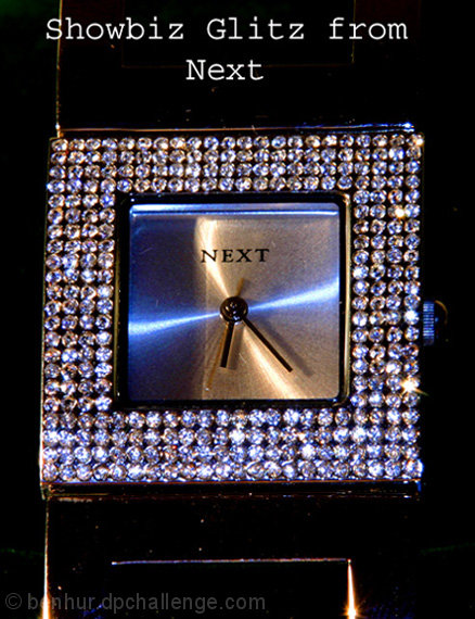
Quite an interesting watch with a lot going on here. I might have tried a different angle: (turned the watch slightly to right or left) 1. So it didn't appear so calculated, the crop is tight and the watch face being square gives a boxed in feeling. 2. With a different angle there would be more depth to to the shot and we might be able to pull more detail from the stones on the face.
Also I might have used more light, I don't have a lightbox or tent so I would have rigged a set up with a white sheet and shinned lots of light from both sides through the sheet on to the watch in order to use a small f/stop to obtain focus through the whole shot. |
|
| Photographer found comment helpful. |
|
|
04/28/2005 04:21:33 PM |
Lighting is a bit harsh here creating some unwanted edge glow on the band that is a distraction in the shot in my opinion.
Image sharpness could be a little higher too, as the "diamonds" seem to be low on detail. (5) |
|
| Photographer found comment helpful. |
|
|
04/28/2005 10:25:49 AM |
| Composition too centered think. Watch dial not lighted evenly. Lacks focus/sharpness on stones. |
|
| Photographer found comment helpful. |
|
|
04/28/2005 10:00:17 AM |
| Neat idea, the image has a bit too much blue color cast in it for me. The jewelry piece itself I think could be cleaner - some dust on the band and the face of the watch that would have improved the image if it wasn't there. Good luck. |
|
| Photographer found comment helpful. |
|
|
04/28/2005 08:05:27 AM |
| Nice idea, perhaps a little too central and lacking in definition. I really like the colours of the clock. |
|
|
|
04/27/2005 07:16:24 PM |
| I like the watch and the comp of the ad, it needs to be crisper in order to be effective. Tag line is direct and effective. |
|
| Photographer found comment helpful. |
|
|
04/26/2005 01:33:48 PM |
| Very dark composition and the darkness on half the watch face is a bit distracting. |
|
| Photographer found comment helpful. |
|
|
04/26/2005 02:52:27 AM |
| would have preferred a larger crop. |
|
| Photographer found comment helpful. |
|
|
04/26/2005 02:27:07 AM |
| nice watch focus is off though |
|
| Photographer found comment helpful. |
|
|
04/25/2005 06:36:41 PM |
| Odd composition and lighting. Focus is somewhat wrong and kills the sharpness required for so many jewels. Lighting is interesting, but the mix in colours doesn't really work to give this shot the appealing factor it needs to 'sell'. text is dull and not attractive either. 5 |
|
| Photographer found comment helpful. |
|
|
04/25/2005 05:28:45 PM |
| Focus is a bit off. More background would make it stand out better. |
|
| Photographer found comment helpful. |
|
|
04/25/2005 04:12:40 PM |
| Nice image. I think a little more light would have made it shine more but over all good photo. |
|
| Photographer found comment helpful. |
|
|
04/25/2005 02:46:39 AM |
| Difficult jewel to take a picture of, but you pulled it off nicely ... maybe it required more light? |
|
| Photographer found comment helpful. |
|
|
04/25/2005 12:45:11 AM |
| over shapening? not sure... |
|
| Photographer found comment helpful. |
|
|
04/25/2005 12:14:25 AM |
| The bands showing up in the shot really distract from the whole image. The color isn't very pleasing and almost looks like a snapshot using flash only as a light source. |
|
| Photographer found comment helpful. |
Home -
Challenges -
Community -
League -
Photos -
Cameras -
Lenses -
Learn -
Help -
Terms of Use -
Privacy -
Top ^
DPChallenge, and website content and design, Copyright © 2001-2025 Challenging Technologies, LLC.
All digital photo copyrights belong to the photographers and may not be used without permission.
Current Server Time: 03/13/2025 06:12:04 AM EDT.