| Author | Thread |
|
|
05/03/2005 08:35:53 AM |
| I have learned alot on this photo and all of your comments. Thanks. |
|
Comments Made During the Challenge  |
|
|
05/01/2005 04:00:52 PM |
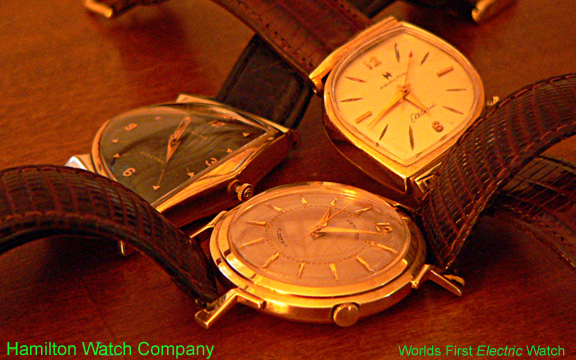
I have absolutely no suggestions or ideas how to arrange 3 watches in a shot to make it interesting, so I can't say good or bad about the composition. Overall a bit dark and lacking in contrast. Green text is far too much of a clash for the shot in my opinion. (5)
|
|
 Photographer found comment helpful. Photographer found comment helpful. |
|
|
05/01/2005 12:12:42 PM |
| I can understand the coloring of the picture, but the green font is distracting. |
|
| Photographer found comment helpful. |
|
|
05/01/2005 10:51:10 AM |
| I don't like your choice of font or font color here. I think your shot of the watches is nice, despite what looks like a slight yellow cast, but the cast does add a feeling of nostalgia of some sort, so perhaps that is fitting. |
|
| Photographer found comment helpful. |
|
|
04/30/2005 09:07:05 PM |
| Focus and dof a problem when trying to do multiple pieces, would have been better using one piece or beating the dof issues |
|
| Photographer found comment helpful. |
|
|
04/29/2005 11:34:27 PM |
| I like the lighting it stes the period. BTW the hands should be set at 10 to it is more aethetically pleasing. 8 |
|
| Photographer found comment helpful. |
|
|
04/29/2005 11:10:18 PM |
| I like the concept, but I wish I could see the face of each watch better. |
|
| Photographer found comment helpful. |
|
|
04/29/2005 10:31:17 PM |
| Maybe a little more tilt forward of the watch faces and a closer crop of the metal showing at the top. Also not sure about the green text; it takes away from the predominantly neutral tones. |
|
| Photographer found comment helpful. |
|
|
04/29/2005 01:28:10 PM |
| Seems as if the white balance if off. |
|
| Photographer found comment helpful. |
|
|
04/28/2005 10:14:27 PM |
| I think that if you removed the red/orange cast it would improve it |
|
| Photographer found comment helpful. |
|
|
04/28/2005 05:26:32 PM |
| Good arrangement of timepieces but the white balance is quite off: an orange glow from indoor lighting. |
|
| Photographer found comment helpful. |
|
|
04/28/2005 02:31:59 PM |
| I liek the layout, but I think it needs more contrast. Perhaps the white balance needs adjusting so it loses some of the orange hue. |
|
| Photographer found comment helpful. |
|
|
04/28/2005 11:34:23 AM |
| White balance seems off, unless that's what you were after. The watch in the foreground looks very interesting and should have been the main subject. Also, the low angle you choose show little of the closest watch; and there's quite a bit of glare in the glasses. Text in not intrusive, good, but color is distracting. |
|
| Photographer found comment helpful. |
|
|
04/28/2005 08:16:18 AM |
| Nice composition. To me the lighting seems a little yellow and I've love to have seen a sharper focus on the watch at the back. Really do like the way you have them displayed. |
|
| Photographer found comment helpful. |
|
|
04/28/2005 01:28:04 AM |
| I looks as if your white balance is off. Nice composition. |
|
| Photographer found comment helpful. |
|
|
04/27/2005 09:56:13 PM |
| I like the picture but the lime green text doesn't work well with it |
|
| Photographer found comment helpful. |
|
|
04/27/2005 03:28:18 PM |
| The green text was a poor choice here. |
|
| Photographer found comment helpful. |
|
|
04/27/2005 01:56:17 PM |
| im sorry but this for some reason is really remniscent of popup adds in general. |
|
| Photographer found comment helpful. |
|
|
04/27/2005 12:55:57 PM |
| First thing, the colour of the text is all wrong., It really breaks the mood of this shot. Composition could use some work as we see little details like the boarders of the watchs beneath the closest watch's bracelet. The tip of the right watch's bracelet. Those are all distracting details which makes this shot less then perfect. The lighting is interesting as it gives power to the gold, but unfortunatly, takes away from the sharpness, making the picture seem out of focus slightly. nice try. 5 |
|
| Photographer found comment helpful. |
|
|
04/26/2005 09:19:28 PM |
I really like the variety of textures; wood, leather, gold, glass. Serene, staid, warm, comfortable, safe, serious, dignified, and rich. I wish more than the stitching of the band appeared to me to be in crisp focus.
I'm afraid some mischievous hacker has squeezed into the corners of this photo some text in electric-green, san serif font AAAAAAAARRRRRGGGGGHHHHH!!!! Perhaps you should consider having them reported and banned from the site. |
|
| Photographer found comment helpful. |
|
|
04/26/2005 05:46:35 PM |
| I'm sure many people have bashed the green text... Well... Lose the green text man. :-) |
|
| Photographer found comment helpful. |
|
|
04/26/2005 03:19:26 PM |
| If you were going for a rich warm tone, it worked. If not - the lighting is off a bit. ;^) I like the way you've grouped the watches, it's a unique twist to what I've seen thus far. One problem with the watches laying flat is you're getting some excess reflections on the watch faces. A polarizer would have helped some with that. Regarding the text, another color choice might have been a gold that coordinates with the watches. Of course, this all just my opinion. Hope all goes well for you with the challenge - good luck. |
|
| Photographer found comment helpful. |
|
|
04/26/2005 02:48:35 PM |
| white balance might be off |
|
| Photographer found comment helpful. |
|
|
04/26/2005 01:36:01 PM |
| I think you have an excellent idea for the composition, but the redish cast and green text are not appealing. |
|
| Photographer found comment helpful. |
|
|
04/26/2005 10:16:50 AM |
| White balance seems too yellow. If that's intentional, I'm sorry, but it doesn't work well for me. |
|
| Photographer found comment helpful. |
|
|
04/26/2005 07:58:56 AM |
| I feel this photo would benefit from sharper focus on the watch faces themselves. Additionally, I'm not so sure about the color tone, and the text's font and color. |
|
| Photographer found comment helpful. |
|
|
04/26/2005 03:42:49 AM |
| like the set up not the colour of the wording gold would be better IMHO |
|
| Photographer found comment helpful. |
|
|
04/26/2005 01:07:45 AM |
| Now you're going to make me dig through more old boxes to see if I have one of these : ) |
|
| Photographer found comment helpful. |
|
|
04/25/2005 11:51:15 PM |
| I like the way the watches are set up, though I don't care for the yellowish cast that the photo seems to have, also I don't personally care for the green text. |
|
| Photographer found comment helpful. |
|
|
04/25/2005 10:02:51 PM |
| The watches need to stand out more. Nice composition. |
|
| Photographer found comment helpful. |
|
|
04/25/2005 09:32:27 PM |
| I think the yellowish overcast and the green letteris just don't work too well here. Perhaps a little more contrast and better lighting might help? The watches' shapes and placement are unique and creative, though! Good shooting. |
|
| Photographer found comment helpful. |
|
|
04/25/2005 04:53:09 PM |
| The coloring seems a bit off to me (a little heavy on the yellows)... not sure I would have complimented it with the green text, either... but I like the arrangement of the watches. |
|
| Photographer found comment helpful. |
|
|
04/25/2005 03:15:52 PM |
|
| Photographer found comment helpful. |
|
|
04/25/2005 12:49:20 PM |
| I like the photo a lot but the green text clashes in my eyes. A different color might have done better. |
|
| Photographer found comment helpful. |
|
|
04/25/2005 11:21:36 AM |
| Love the watches coloring. Like that their are multiple watches. Not sure about the text color but it does stand out. I gave it a 7. |
|
| Photographer found comment helpful. |
|
|
04/25/2005 10:14:22 AM |
| nice lighting. The reflection on the watch faces are alittle distracting but still an excellent shot. |
|
| Photographer found comment helpful. |
|
|
04/25/2005 09:12:26 AM |
| the text color was not a great choice for this image. White or black would have been better I think. A slightly deeper DoF to get the right hand watch in sharp focus would also have helped. Very nice, though.- 7 |
|
| Photographer found comment helpful. |
|
|
04/25/2005 07:55:05 AM |
| Beautiful watches in a interesting setting. The teardrop watch, to me, should be the center of focus because it is the lightest of the three and the lightest part of a picture draws the eyes first when it's surrounded with dark. It would have been nice to have all the watches have the same time on them. That would imply that they were still working. Personally, I might have used a sepia toning. |
|
| Photographer found comment helpful. |
|
|
04/25/2005 02:08:55 AM |
| Bad choice of font colors in an otherwise exceptional shot. |
|
| Photographer found comment helpful. |
|
|
04/25/2005 01:55:58 AM |
| light is too orangish (if that's a word) ...gl |
|
| Photographer found comment helpful. |
|
|
04/25/2005 12:41:19 AM |
| Very red tint to the whole picture. The white balance needs to be adjusted to reflect the correct color lightning here. Used flash? |
|
| Photographer found comment helpful. |
|
|
04/25/2005 12:35:17 AM |
| Very interesting watches, but color of text seems very distracting. White text might have worked better. |
|
| Photographer found comment helpful. |
Home -
Challenges -
Community -
League -
Photos -
Cameras -
Lenses -
Learn -
Help -
Terms of Use -
Privacy -
Top ^
DPChallenge, and website content and design, Copyright © 2001-2025 Challenging Technologies, LLC.
All digital photo copyrights belong to the photographers and may not be used without permission.
Current Server Time: 03/12/2025 02:53:10 PM EDT.