| Author | Thread |
Comments Made During the Challenge  |
|
|
04/30/2005 07:39:04 PM |
| Not sharp enough - can't see enough of the jewel. I love the mistral font. :) I wish I could see more of the actual jewelry. |
|
 Photographer found comment helpful. Photographer found comment helpful. |
|
|
04/30/2005 02:47:59 PM |
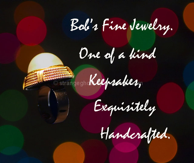
| love the background and the lettering, I would have postioned the ring differently. It looks like a mushroom and doesn't compell me to buy the item. |
|
| Photographer found comment helpful. |
|
|
04/30/2005 12:39:25 PM |
| the copy is too much and overpowers, as does the background, the subject. |
|
| Photographer found comment helpful. |
|
|
04/30/2005 03:38:42 AM |
| I Lost it in the background |
|
| Photographer found comment helpful. |
|
|
04/30/2005 02:53:19 AM |
|
| Photographer found comment helpful. |
|
|
04/29/2005 02:58:48 PM |
| Bumping you up! Bet Only Keen Eyes Have spotted the visual pun. |
|
| Photographer found comment helpful. |
|
|
04/29/2005 07:47:15 AM |
| Very unique approach with the color circles. How'd you do that? Looks like bokah but I know it isn't. Is it the background itself? Hmmm... Af for the actual jewelry image, it's ok. The top of the stone and gold band area are lit ok, maybe a bit hot, while the black ring blends into the background a little too much. If you had lined the ring part up with one of the color circles it might have been more identifiable. Anyway, good luck on the challenge. |
|
| Photographer found comment helpful. |
|
|
04/29/2005 07:25:27 AM |
| I wish the ring had been lit up more. I like the background although I think it does distract from the ring a bit. 8 |
|
| Photographer found comment helpful. |
|
|
04/29/2005 01:12:59 AM |
| I think the circles are a little distracting, or a little on the big side. |
|
| Photographer found comment helpful. |
|
|
04/28/2005 12:11:12 PM |
| I think the background is cool its really nice however the light on the ring is a litte off otherwise nice job |
|
| Photographer found comment helpful. |
|
|
04/28/2005 10:57:36 AM |
| Over the top bokeh and text is too intrusive in my opinion. The ring seems like an aftertought. |
|
| Photographer found comment helpful. |
|
|
04/28/2005 07:53:00 AM |
| I like the concept, but to me the busyness of the b/g takes the focus off the jewellery |
|
| Photographer found comment helpful. |
|
|
04/28/2005 12:50:24 AM |
| I'm afraid that the background and text detract from the ring in this for my taste at least |
|
| Photographer found comment helpful. |
|
|
04/27/2005 09:31:56 PM |
| Background is distracting |
|
| Photographer found comment helpful. |
|
|
04/26/2005 11:15:36 PM |
Having a hard time with this one.
The ring isn't lit well enough in the band to really make out what it is.
The text is so big/spaced far apart it is difficult to read.
The background is pretty unique and cheerful. (5) |
|
| Photographer found comment helpful. |
|
|
04/26/2005 10:05:45 PM |
| I think the background makes Bob's fine jewelry look too cheap and kitschy. |
|
| Photographer found comment helpful. |
|
|
04/26/2005 08:01:02 PM |
| The comp here is fantastic, A different font, consistancy with punctuation (Artist license doesn't extend that far) and more contrast with the ring would be needed to make this a proffesional Ad. Great background and font. |
|
| Photographer found comment helpful. |
|
|
04/26/2005 01:22:35 PM |
| Interesting, but too busy a background for such a simple and striking piece of jewelry. |
|
| Photographer found comment helpful. |
|
|
04/25/2005 11:33:34 PM |
| The large polka dots in the background are very distracting in my opinion. |
|
| Photographer found comment helpful. |
|
|
04/25/2005 09:40:22 PM |
| A little too busy for my taste. |
|
| Photographer found comment helpful. |
|
|
04/25/2005 09:18:27 PM |
| the colored circles distract greatly from the picture |
|
| Photographer found comment helpful. |
|
|
04/25/2005 10:34:39 AM |
| at first I thought the ring was a light. I like the "christmas light" background |
|
| Photographer found comment helpful. |
|
|
04/25/2005 09:38:06 AM |
| A really nice and effective image a bit overwhelmed by text...maybe a different size/font/color may have helped. |
|
| Photographer found comment helpful. |
|
|
04/25/2005 06:55:02 AM |
| Am I looking at photography here, or reading copy? Text is far too domineering. band of ring not lit enough to be visible. |
|
| Photographer found comment helpful. |
|
|
04/25/2005 02:26:37 AM |
| To much destration with all the dots. Gold is giving off to much shine. |
|
| Photographer found comment helpful. |
|
|
04/25/2005 01:59:57 AM |
| Here the text O V E R P O W E R S the image by magnitudes. Frankly, it scared me. ;-) |
|
| Photographer found comment helpful. |
|
|
04/25/2005 12:50:37 AM |
| font and background seem to playful ...when ring is SERIOUS...gl |
|
| Photographer found comment helpful. |
|
|
04/25/2005 12:27:08 AM |
| horrible choice of font imo. has a 'cheap design' feel to it. |
|
| Photographer found comment helpful. |
Home -
Challenges -
Community -
League -
Photos -
Cameras -
Lenses -
Learn -
Help -
Terms of Use -
Privacy -
Top ^
DPChallenge, and website content and design, Copyright © 2001-2025 Challenging Technologies, LLC.
All digital photo copyrights belong to the photographers and may not be used without permission.
Current Server Time: 03/12/2025 08:48:43 AM EDT.