| Author | Thread |
|
|
05/05/2005 09:15:00 AM |
Greetings from the Critique Club...
Hi DogAngel...
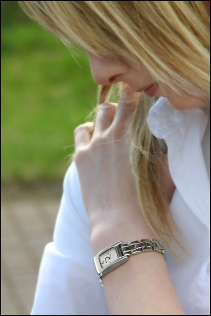
I think your pose and subject here are right on target for a jewelry advertisement photograph. Your post processing seems to work OK but the 'environment' may not be the best choice overall. I believe your model's arm and the watch would stand out more if she was wearing a darker colored shirt. The blue cast you were describing probably is a result of sunlight (or diffused sunlight) on her shirt. The background in this photo is also an element that may require some attention. I believe the green grass would make a good background itself, but the contrast between the brick and the grass may be considered distracting in some cases...
John Setzler
|
|
 Photographer found comment helpful. Photographer found comment helpful. |
Comments Made During the Challenge  |
|
|
05/01/2005 10:41:50 AM |
| I like the overall feel of your shot, but I do have to comment on the placement of your model's hand...at first glance I thought she was picking her nose. Granted, it could just be me...it probably is just me. |
|
| Photographer found comment helpful. |
|
|
04/30/2005 03:37:52 PM |
| An interesting image as it seems to fit the model/product advertising format. The model, the hair and the pose is great but there is a little more that should have been done with the watch so as to catch the eye. Bumping up. |
|
| Photographer found comment helpful. |
|
|
04/30/2005 02:46:55 PM |
| This is not a compelling shot that makes you want to purchase the item. |
|
| Photographer found comment helpful. |
|
|
04/30/2005 02:45:41 PM |
| This would do well as a "stock" image, altough I don't see it as a jewelry advertisement |
|
| Photographer found comment helpful. |
|
|
04/30/2005 01:36:03 PM |
| I like the idea ... I just wish it was a closer crop on the watch so that I could see it more clearly. |
|
| Photographer found comment helpful. |
|
|
04/30/2005 02:26:11 AM |
| great to see a person in the photo 9 |
|
| Photographer found comment helpful. |
|
|
04/29/2005 10:28:25 PM |
| Nice color; however, my eye is drawn all over and I know it should focus on the watch. Nice shallow DOF. |
|
| Photographer found comment helpful. |
|
|
04/29/2005 08:30:43 PM |
| I disagree with some who say that a watch is not jewellery, however I think this misses the mark a bit for advertising as it doesn't show the watch in sufficient detail to make a lifestyle statement |
|
| Photographer found comment helpful. |
|
|
04/29/2005 01:25:34 PM |
| Lovely portrait of the woman, but the timepiece IMO is underemphasized by lack of lighting. Light focus seems to fall on the womans shoulder. |
|
| Photographer found comment helpful. |
|
|
04/28/2005 10:15:11 PM |
| Excellent focus on the watch |
|
| Photographer found comment helpful. |
|
|
04/28/2005 08:54:09 PM |
| Nice capture. Well lit, not too strong. |
|
| Photographer found comment helpful. |
|
|
04/28/2005 04:43:12 PM |
| Focus on the watch is great. I think this would have been better with a tighter crop, and maybe more of the model's face displayed. |
|
| Photographer found comment helpful. |
|
|
04/28/2005 09:55:24 AM |
| Nice focus on the watch with the person a secondary. Could have used a bit more cropping from the top. |
|
| Photographer found comment helpful. |
|
|
04/27/2005 08:37:00 AM |
Strong image to tap into the subconscious of the utilitarian majority. Great choice of model - someone naturally attractive but not self-consciously so or over-primped. Lighting is beautiful and so is DOF. I even like that we do not see the eyes.
I think the strong qualities of this photo are very subtle and understated. Hope it does well. |
|
| Photographer found comment helpful. |
|
|
04/26/2005 07:57:27 AM |
| Very nice. This would make a good, abstract advertizement. |
|
| Photographer found comment helpful. |
|
|
04/26/2005 03:22:24 AM |
|
| Photographer found comment helpful. |
|
|
04/25/2005 10:39:36 PM |
| DOF is quite nice, could've used a little more lighting and i'm not sure about the composition too much. Model didn't seem to enjoy herself too much either. 5 |
|
| Photographer found comment helpful. |
|
|
04/25/2005 08:41:12 PM |
I'm having conflicts here as to what the main focal point is. My eyes keep being drawn to her face and hand, away from the main subject the challenge was about.
Still a good shot regardless. |
|
| Photographer found comment helpful. |
|
|
04/25/2005 07:25:31 PM |
| i find the crop awkward, the lack of eyes and even the posture disturbing |
|
| Photographer found comment helpful. |
|
|
04/25/2005 10:49:08 AM |
| Nice idea, not sure how it's going to go with the majority of voters. The focus object is small in relation to the photo. As a jewelry advertisment challenge...hmmm, well good luck. This might work for the 'Minimalism' challenge. ;^) As a photo I think you did a great job with the lighting, considering you have some backlight with a white shirt - that can be challenging. DOF fades just past the watch, keeping her face and the watch in focus with the hand blurring out - I like that. Good job overall. |
|
| Photographer found comment helpful. |
|
|
04/25/2005 10:41:26 AM |
| Very nice. Perhaps if the watch was sitting a little different on her wrist. So you could see more of the watch. |
|
| Photographer found comment helpful. |
|
|
04/25/2005 10:27:09 AM |
| nice job, I think I would have turned the watch and her hand so that we didn't see so much of the back of her hand, it's just a lot of skin surface to draw your eye away from the watch. |
|
| Photographer found comment helpful. |
|
|
04/25/2005 02:30:22 AM |
| Nice, but the watch is not in focus. She has a great arm for silver. |
|
| Photographer found comment helpful. |
|
|
04/25/2005 02:18:32 AM |
| Good DOF which brings the eye to the watch where it belongs. |
|
| Photographer found comment helpful. |
Home -
Challenges -
Community -
League -
Photos -
Cameras -
Lenses -
Learn -
Help -
Terms of Use -
Privacy -
Top ^
DPChallenge, and website content and design, Copyright © 2001-2025 Challenging Technologies, LLC.
All digital photo copyrights belong to the photographers and may not be used without permission.
Current Server Time: 04/10/2025 09:55:48 AM EDT.