| Author | Thread |
|
|
05/02/2005 12:00:13 AM |
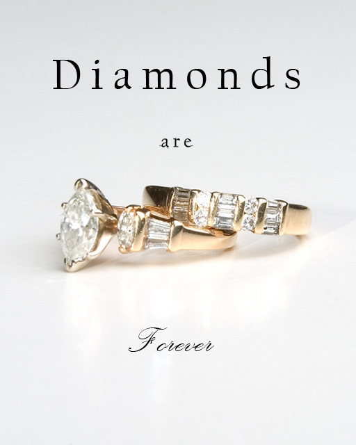
| Very pretty- I know not much of a comment, but its pretty! -- 9 |
|
Comments Made During the Challenge  |
|
|
05/01/2005 11:38:25 AM |
|
|
|
05/01/2005 01:10:32 AM |
| Really looks like an advertisement, Reflection off the surface is a nice touch. GL |
|
|
|
04/30/2005 05:02:07 PM |
| Pretty good exposure and control of the reflections and shadows. |
|
|
|
04/30/2005 02:15:17 AM |
| Using the same font for "are" and "forever" could have enhanced the immage a thoudsand times... especially the font used for "forevenr" looks pretty good. |
|
 Photographer found comment helpful. Photographer found comment helpful. |
|
|
04/29/2005 07:20:26 AM |
| Very nice. the clarity on the rings is great. The stones are shining up good. I like the shimmer the floor gives also. Font is nice as well. 10 |
|
| Photographer found comment helpful. |
|
|
04/29/2005 06:46:04 AM |
| Good photo. Nice light, gives it a 3 dimensional look. Don't aprove the 2 different tipe of letters though.8 |
|
| Photographer found comment helpful. |
|
|
04/29/2005 12:28:50 AM |
| Nice, Clean and Simple. This is a very good shot. I personally would have stayed with one font throughout the advert, completely different fonts tend to make my interest point switch between the top and bottom of the shot making the rings secondary. The same font here would act to frame the ring keeping my interest in the center of the shot. The rings themself seem a little soft and lacking detail but this is still a very good shot and I marked it higher than most. |
|
| Photographer found comment helpful. |
|
|
04/28/2005 09:24:11 PM |
| Better than any catalog shot out there. Great job. |
|
| Photographer found comment helpful. |
|
|
04/28/2005 01:51:02 PM |
| nice text, great background, well done. |
|
|
|
04/28/2005 08:53:24 AM |
| A bit too much light reflecting in the diamonds I think. Details are lost in the diamonds; can't see the diamond faces |
|
| Photographer found comment helpful. |
|
|
04/28/2005 06:51:57 AM |
| Great ad. nice text, layout, etc. One small thing would be the reflection of the rings on the base material? A bit distracting I think. 7 |
|
| Photographer found comment helpful. |
|
|
04/27/2005 10:03:08 PM |
| Very nice. I gave this a 7. It would be better if the diamonds were a larger portion of the image. |
|
| Photographer found comment helpful. |
|
|
04/27/2005 03:11:45 PM |
| Good lighting and text, maybe the large diamond should be facing front a touch more. |
|
| Photographer found comment helpful. |
|
|
04/27/2005 01:19:29 PM |
| excellent choice of font for 'forever' wish there was more detial in the diamonds, especially the big one on the left. but good photo overall. |
|
| Photographer found comment helpful. |
|
|
04/27/2005 01:06:59 PM |
| simple, classic..copied? no really, well done on a tough subject |
|
|
|
04/27/2005 10:30:04 AM |
| I like the composition with the exception of the bottom . . . there seems to be too much empty space. |
|
|
|
04/27/2005 08:58:35 AM |
|
|
|
04/26/2005 10:08:13 PM |
| nice lighting and a good clean design. focus is a little soft. I don't understand your choice of 3 different font size and two type faces. keep it simple. |
|
| Photographer found comment helpful. |
|
|
04/26/2005 10:04:21 PM |
This has a nice feel to it - simple & clean. The lighting works well here.
I have mixed feelings on the mixing of the font, and the word "are" isn't very clean (no biggie really)
|
|
| Photographer found comment helpful. |
|
|
04/26/2005 05:19:47 PM |
| Nice shot. Did you copy this from a magazine? :) |
|
|
|
04/26/2005 03:15:22 PM |
| Nice comp and photo, I'd change the font to something less complicated. Overall very nice. Nice text placement. |
|
|
|
04/26/2005 01:59:22 PM |
| I like your idea, but I think you've lost some of the sparkle you could have from the diamonds. |
|
|
|
04/26/2005 12:39:24 PM |
| Your layout is good and the how the rings are sitting, however I do not like the lightness of the rings. |
|
|
|
04/26/2005 03:40:05 AM |
| good advertisment but image looks a little dull |
|
|
|
04/26/2005 02:46:49 AM |
|
|
|
04/25/2005 06:39:49 PM |
| the layout here is very nice...it just feels a bit washed out on that backroiund for me...good luck |
|
| Photographer found comment helpful. |
|
|
04/25/2005 04:19:32 PM |
| Nice photo the text is a little large compared to the rings but nice overall image! |
|
| Photographer found comment helpful. |
|
|
04/25/2005 03:44:04 PM |
| Wonderful presentation and the lighting is excellent. I wish there was a little bit better focus on the center stone, however, as it's slightly blurry. Overall excellent! 8 |
|
| Photographer found comment helpful. |
|
|
04/25/2005 02:34:33 PM |
| So are the payments... Good one. |
|
|
|
04/25/2005 12:13:37 PM |
| Very impressive layout and a sharper focus would have made this entry top notch. Bumping up. |
|
| Photographer found comment helpful. |
|
|
04/25/2005 10:58:34 AM |
| I like the way the rings are in the center of the image. Pulls your eyes directly to them. Nice proportions. I gave it an 8. |
|
|
|
04/25/2005 09:24:48 AM |
| It's clean, definitely bright...wish there was someway to get some sparkle. I like your choice of text. The 'Forever' is blocking out some of the reflection. 8 |
|
| Photographer found comment helpful. |
|
|
04/25/2005 05:26:50 AM |
|
| Photographer found comment helpful. |
|
|
04/25/2005 02:17:31 AM |
| DOF suffers a little bit here, and the text is a bit overwhelming. But overall I really do like this photo. |
|
| Photographer found comment helpful. |
|
|
04/25/2005 01:05:38 AM |
| elegant and simple...largest stone lit like two round stones on band would have been nice :-) gl with challenge...8 |
|
| Photographer found comment helpful. |
|
|
04/25/2005 12:09:52 AM |
| I think the text detracts ..rings are fabulous on their own 7 |
|
Home -
Challenges -
Community -
League -
Photos -
Cameras -
Lenses -
Learn -
Help -
Terms of Use -
Privacy -
Top ^
DPChallenge, and website content and design, Copyright © 2001-2025 Challenging Technologies, LLC.
All digital photo copyrights belong to the photographers and may not be used without permission.
Current Server Time: 04/25/2025 06:28:14 PM EDT.