| Author | Thread |
Comments Made During the Challenge  |
|
|
05/01/2005 07:52:21 PM |
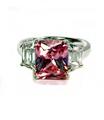
| A nice composition. I would have prefered the concentration of light on the face of the ring. However, there is enough detail showing to make this a very good image. Bumping up. |
|
 Photographer found comment helpful. Photographer found comment helpful. |
|
|
05/01/2005 06:03:07 PM |
| so many things could be said about that website... but I won't nice pic. |
|
| Photographer found comment helpful. |
|
|
05/01/2005 11:13:49 AM |
| I like the simplisticness of this. The only thing I'd change would be to get a little bit more light on the head of the ring (but only the head). |
|
| Photographer found comment helpful. |
|
|
04/30/2005 05:50:06 PM |
| Love the photo - Do not like the font - looks way to jaggity for such a smooth photo. The DOF seems to work but not with this font.. 6 |
|
| Photographer found comment helpful. |
|
|
04/30/2005 01:41:38 PM |
| Good concept, good lighting, and the comp is nice. What would make it better is if the ring was lifted a little to get a better view of the jewels. |
|
| Photographer found comment helpful. |
|
|
04/30/2005 12:29:14 PM |
| Overall, nicely done. The type font has some clipping. |
|
| Photographer found comment helpful. |
|
|
04/30/2005 08:32:46 AM |
| This is a very sharp image and i really love the ring, but I have a problem with the text. The large letters at the top look pixeled and not rounded. It doesn't compliment the image well |
|
| Photographer found comment helpful. |
|
|
04/29/2005 07:07:53 AM |
| BJ.com huh? I think I went to that site once and it wasn't a jewerly site.... Just messin. I like the dof on the image. I wish there had been a bit more light on the stones to bring out the colors in them. 7 |
|
| Photographer found comment helpful. |
|
|
04/29/2005 01:10:33 AM |
| unthinkingly, I actually went to the url. |
|
|
|
04/28/2005 02:21:48 PM |
| Perhaps a smaller font size would be more effective. The dof on the ring itself is nice. |
|
| Photographer found comment helpful. |
|
|
04/28/2005 11:30:32 AM |
| Text is very intrusive; a bit too big. Diamond should have receive more light to have some sparkle. They look dull. |
|
| Photographer found comment helpful. |
|
|
04/28/2005 10:01:54 AM |
| Pretty decent image of the ring. The face of the ring where the jewels (and emphasis is) is a bit dark. Good DOF. The text used looks like it was upsized and looks jagged around the edges. Best of luck in the challenge. |
|
|
|
04/27/2005 07:46:09 PM |
| The photography is great and the color right on but what takes from the ad is the text. It is too hard |
|
|
|
04/27/2005 04:58:10 PM |
| your text looks pixelated, you might want to try to look for the anti-aliasing feature in whatever program you used to add it. |
|
|
|
04/26/2005 10:25:25 PM |
| I'd be real careful going to that website, man. |
|
| Photographer found comment helpful. |
|
|
04/26/2005 10:01:56 PM |
| your ring shot looks great. nice soft lighting and good use of shallow depth of field. I don't care for the font or the dark black choice for it, though. |
|
| Photographer found comment helpful. |
|
|
04/26/2005 09:38:46 PM |
| Its the text. It would have been nice if there was some reflection in the diamonds. I do not like the layout. Wish the diamonds were facing the camera(so all the diamonds are shown) A little reflection on the diamonds may have brought out this ring. Looks like a beautiful ring. |
|
|
|
04/26/2005 07:02:16 PM |
| The angle of the lighting for this shot is wrong which leaves the stones in shadow. You need to lower your light to a point that's almost below the ring in order to get the lighting effect that will focus attention where it needs to be. |
|
| Photographer found comment helpful. |
|
|
04/26/2005 06:23:58 PM |
| Great comp. I prefer a deeper DOF and maybe a different angle on the ring. The text seems to have pixel problem. Your have to add it after you save for web. |
|
| Photographer found comment helpful. |
|
|
04/26/2005 05:28:07 PM |
| Nice composition, but the main part of the ring is too dark. |
|
| Photographer found comment helpful. |
|
|
04/26/2005 02:05:06 PM |
| Nice shot of the ring but I think the lettering colud have been a little less overpowering |
|
| Photographer found comment helpful. |
|
|
04/26/2005 01:26:51 PM |
| I really like the idea and initial spacial composition. I would have loved to have seen the ring tilted up a bit to show more detail. |
|
| Photographer found comment helpful. |
|
|
04/26/2005 01:00:57 PM |
nice pic. ruined by overbearing text
|
|
| Photographer found comment helpful. |
|
|
04/25/2005 07:57:49 PM |
| A lot of potential regarding the quality of the lighting used and the subject material, but the ring seems a bit too low in the frame and the upper text is way too overpowering. |
|
| Photographer found comment helpful. |
|
|
04/25/2005 07:08:16 PM |
| The only thing is I don't see the diamonds sparkling..I think it needs a little sparkle. |
|
| Photographer found comment helpful. |
|
|
04/25/2005 02:05:48 PM |
| You seem to have a nice studio setup here. I wish the gems were lit to sparkle, they seem grimly dull. Advertising wise, your text is overwhelming your product. Perhaps a lighter color, transparent, and/or smaller. Nice DOF. |
|
| Photographer found comment helpful. |
|
|
04/25/2005 12:29:44 PM |
| Nice coloring on the image as a whole, I would have liked to see more of the actualy stones in the ring. |
|
| Photographer found comment helpful. |
|
|
04/25/2005 10:23:27 AM |
|
| Photographer found comment helpful. |
|
|
04/25/2005 09:49:01 AM |
| The picture is beautiful...the text is another story...very jaggy and BIG...you have done a nice job with the gold, very warm and luminous. |
|
| Photographer found comment helpful. |
|
|
04/25/2005 09:05:48 AM |
| IMO, the font distracts from this image, it does not looks "classy" enough I think. Also, I would have tried to get more life and shine into the gems, they look rather dead. perhaps a slightly more "head on" angle to the gems would have helped, instead of looking down on them. |
|
| Photographer found comment helpful. |
|
|
04/25/2005 05:07:36 AM |
| Lacks depth of field for a stand alone image like this, just my humble 2 cents worth |
|
| Photographer found comment helpful. |
|
|
04/25/2005 02:49:32 AM |
| Just as thought... The real www.bj.com is a site about blow j.. The picture is not bad but the fonts need more processing. |
|
|
|
04/25/2005 02:46:01 AM |
| more light on stones..overall nice focus...8 |
|
| Photographer found comment helpful. |
|
|
04/25/2005 02:06:58 AM |
| Oh no ya don't! I'm not gonna click your URL! You'll get love / hate comments for that. Pic's pretty good though - composition and color are good. Good luck. |
|
| Photographer found comment helpful. |
|
|
04/25/2005 02:01:15 AM |
Did you check what kind of web site www.bj.com is? I like the joke (I had my suspicions... if you'd put www.beautyjewel.com I would not bother going there checking it out).
Technically, I wish for a different perspective. This is taken from a higher point I would prefer for a ring of this type - shooting from a slightly lower position would have given you better reflections, I think. 6. |
|
| Photographer found comment helpful. |
|
|
04/25/2005 01:06:27 AM |
| The stones should be lighted to sparkle. |
|
| Photographer found comment helpful. |
|
|
04/25/2005 12:23:19 AM |
| Very nice shot, I would have scored it higher if the diamonds wouldn't have been so dark. But a very nice shot nevertheless. |
|
| Photographer found comment helpful. |
|
|
04/25/2005 12:12:29 AM |
| I just looked up BJ.com and OMG the kids were around............. |
|
Home -
Challenges -
Community -
League -
Photos -
Cameras -
Lenses -
Learn -
Help -
Terms of Use -
Privacy -
Top ^
DPChallenge, and website content and design, Copyright © 2001-2025 Challenging Technologies, LLC.
All digital photo copyrights belong to the photographers and may not be used without permission.
Current Server Time: 03/12/2025 02:41:22 PM EDT.