| Author | Thread |
Comments Made During the Challenge  |
|
|
05/01/2005 02:40:46 PM |
| while under normal circumstances this fits as a minimalist piece, i would encourage you to reread the challenge description... |
|
|
|
04/30/2005 07:16:35 PM |
|
|
|
04/29/2005 07:35:51 PM |
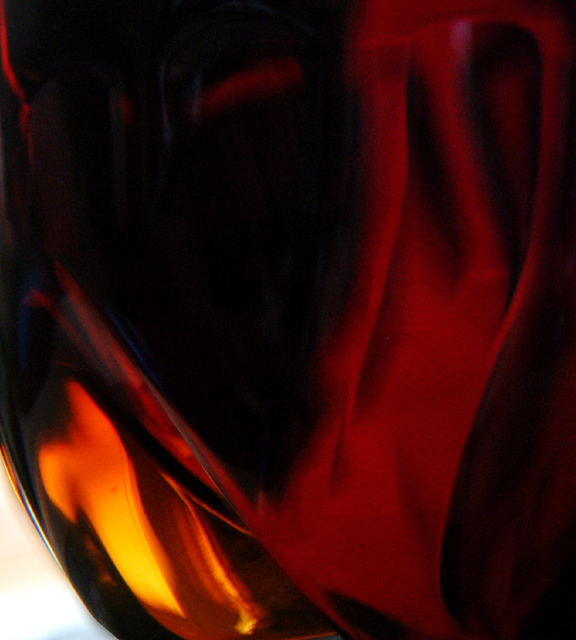
| interesting nude. I think this image would work well if the bottom left corner was the same color as the rest of the print, the white is very distracting. |
|
|
|
04/29/2005 04:28:17 PM |
| not sure what is being minimalized here. I do like the llok of this though. |
|
|
|
04/29/2005 11:12:56 AM |
|
|
|
04/29/2005 10:54:17 AM |
| Interesting shot and wondeful colors, but too much going on to be considered minimalism according to the rules. |
|
|
|
04/29/2005 02:28:41 AM |
| very nice photo, but how does it fit the challenge? |
|
|
|
04/29/2005 12:49:27 AM |
|
|
|
04/28/2005 04:42:31 PM |
| I like this very much; the form and color both appeal to me. Unfortunately I don't think it meets either the artistic or the dpc definitions of minimalism and I feel bad giving it a low rating. |
|
|
|
04/28/2005 12:27:08 PM |
|
|
|
04/28/2005 10:46:46 AM |
| Not sure where I should be looking. I find my eye pulled by the shadows and lines as much as by the bright spot in the bottom left. |
|
|
|
04/28/2005 10:39:13 AM |
| My aye is drawn to the shadows and shapes of the background and find the bright orange area to be only distracting. |
|
|
|
04/28/2005 09:23:09 AM |
| This feels more abstract than minimal |
|
|
|
04/27/2005 08:15:40 PM |
| Abstract it is! I like it though, nice colors! |
|
|
|
04/27/2005 06:56:14 PM |
|
|
|
04/27/2005 06:21:54 PM |
| A nice flow and abstraction but I can't see the minimalism here. |
|
|
|
04/27/2005 05:31:02 PM |
| doesn't do anything for me, i don;t like the high film speed evidence, and im not really sure i know what this is, not sure if it fits the challenge as well, 2 |
|
|
|
04/27/2005 12:01:47 PM |
| The white triangle is a little too bright, and therefore pulls the eye too much. |
|
|
|
04/27/2005 02:26:48 AM |
| Well, it's certainly abstract. The colors are very nice, but the bright orange segment seems fuzzy and grainy, with a dark fleck (dirt on the sensor?) that draws the eye without adding to the interest. |
|
|
|
04/27/2005 01:55:54 AM |
| I really like the picture, but I'm not sure so much about the 'minimalism' aspect of it. |
|
Home -
Challenges -
Community -
League -
Photos -
Cameras -
Lenses -
Learn -
Help -
Terms of Use -
Privacy -
Top ^
DPChallenge, and website content and design, Copyright © 2001-2025 Challenging Technologies, LLC.
All digital photo copyrights belong to the photographers and may not be used without permission.
Current Server Time: 03/12/2025 11:41:10 AM EDT.