| Author | Thread |
Comments Made During the Challenge  |
|
|
05/03/2005 09:20:20 PM |
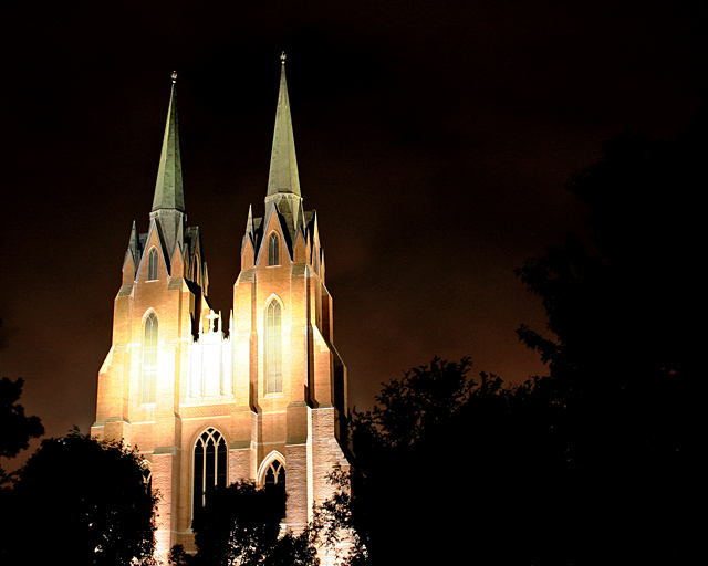
| Harsh light; the faces of the towers are overexposed. The light on the turrets looks good. You might have been better off framing your shot to include only the tops of these towers. |
|
 Photographer found comment helpful. Photographer found comment helpful. |
|
|
05/02/2005 11:54:54 PM |
|
| Photographer found comment helpful. |
|
|
05/02/2005 10:58:04 PM |
| Maybe it is just my monitor, but the lighting looks way to harsh across the middle of the church. 5 |
|
| Photographer found comment helpful. |
|
|
05/02/2005 08:59:01 PM |
| the center of the church is overexposed, could have been great otherwise |
|
| Photographer found comment helpful. |
|
|
05/02/2005 04:15:52 AM |
|
| Photographer found comment helpful. |
|
|
04/30/2005 10:43:03 PM |
| Wow, that's extremely dramatic lighting. Looks nearly fake. Great! |
|
| Photographer found comment helpful. |
|
|
04/30/2005 10:35:54 AM |
| I like how the tree silouettes frame the church, it makes the photo have a unique feel |
|
| Photographer found comment helpful. |
|
|
04/30/2005 07:11:49 AM |
| what a beautiful structure...the light across the middle is a bit too harsh for me....good luck |
|
| Photographer found comment helpful. |
|
|
04/29/2005 10:19:38 PM |
|
| Photographer found comment helpful. |
|
|
04/29/2005 06:58:38 PM |
| Smaller would add to this. |
|
| Photographer found comment helpful. |
|
|
04/29/2005 11:21:09 AM |
| What a wonderful picture. I love it, just wonder if it really fits the challenge since the church takes up half the frame. |
|
| Photographer found comment helpful. |
|
|
04/29/2005 03:12:34 AM |
| too much light in the middle of the building |
|
| Photographer found comment helpful. |
|
|
04/28/2005 11:50:52 PM |
| Blown highlights and I feel the light in the background distracts from the photo too. Maybe waiting another 30 minutes to take the picture would have helped. |
|
| Photographer found comment helpful. |
|
|
04/28/2005 08:29:50 PM |
Night shots are difficult to get the dark areas bright enough without burning out the lighted areas. You have come to a good compromise here
|
|
| Photographer found comment helpful. |
|
|
04/28/2005 07:48:21 PM |
| A little large, I believe. Beautiful photo. |
|
| Photographer found comment helpful. |
|
|
04/28/2005 07:10:53 PM |
| I feel as if the subject here is the entire church, not sure if that is correct however. Since this is the case, I feel that you do not meet the requirements of the photo, since it takes up about 40% of the given frame. |
|
| Photographer found comment helpful. |
|
|
04/28/2005 12:55:12 PM |
| Strong subject but i think it is a little large |
|
| Photographer found comment helpful. |
|
|
04/27/2005 10:01:13 PM |
| I'm sure some will score low simply because of size. I don't mind this, but I am concerned about the blown out highlights in the centre. Better exposure would have scored an extra 1-2 points in my mind. Definately worth going back to reshoot - lovely structure and could have some cracker colouring - I'd also aim to shoot just a touch earlier and get some more complimentary colours in the sky. |
|
| Photographer found comment helpful. |
|
|
04/27/2005 06:42:42 PM |
| cool photo but not for this challenge. |
|
| Photographer found comment helpful. |
|
|
04/27/2005 05:20:02 PM |
| Oh, this is JUST beautiful!!!!!!! So sharp for a night shot. |
|
| Photographer found comment helpful. |
|
|
04/27/2005 04:38:23 PM |
| The subject takes up a bit too much of the frame for me. Also, the highlights on the building seem a little too harsh. |
|
| Photographer found comment helpful. |
|
|
04/27/2005 02:00:21 PM |
| that spot is over exposed, hurts the eyes a bit. |
|
| Photographer found comment helpful. |
|
|
04/27/2005 10:29:34 AM |
| good composition, but the highligths were burned |
|
| Photographer found comment helpful. |
|
|
04/27/2005 06:51:24 AM |
| Looks like the highlights have just blown a little |
|
| Photographer found comment helpful. |
Home -
Challenges -
Community -
League -
Photos -
Cameras -
Lenses -
Learn -
Help -
Terms of Use -
Privacy -
Top ^
DPChallenge, and website content and design, Copyright © 2001-2025 Challenging Technologies, LLC.
All digital photo copyrights belong to the photographers and may not be used without permission.
Current Server Time: 03/12/2025 02:31:09 AM EDT.