| Author | Thread |
|
|
04/17/2003 08:42:42 PM |
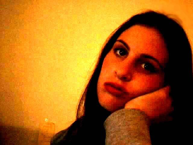
This is quite a nice photograph. The warmth is very nice and I can imagine a sadness in the model's eyes. The challenge is "Color" and the color in your photograph is certainly an important element use to evoke feelings in the viewer.
This looks as if there is a texture applied to the image but I suppose it's just some form of pixelation. The texture enhances the moodiness of the picture when applied to the face and clothing but it is very distracting on the wall especially to the left side. The pixelation would generally not do well with most subjects so I suggest that you grab a copy of NeatImage to see whether it would help enhance your other photographs.
The butterfly lighting helps to show all the features of the lady's face. If it were less of a "moody" picture, I would probably object to the multiple catchlights in the each eye but they don't distract me from enjoying the image. The focus is soft, but, again, under these conditions that doesn't distract and seems to add to the moodiness of the picture.
The darkening toward the edges helps to concentrate the eye on the subject. Because of the tilt of the head and the shadows in the lower left corner, I tend to think that the photograph isn't actually straight. The one white spot to the left of the subject draws the eye away. (Too bad we can't spot edit!)
You've accomplished very nice composition leaving enough room to the side of the your model in the direction her body is facing. Also, there is enough room above her to keep from feeling that she's crowded.
I see your note which says, "A photograph of a broken heart. The lighting and the color capture the warmth that was once present." I might have tried to interpret this with a "blue" color for feelings of sadness rather than "the warmth that was once present". Your interpretation is still excellent and, especially with the note, conveys what I think you wanted to convey. Thanks for submitting it and I look forward to seeing your future work.
Regards ... from the Critique Club,
Bob Mahan
(rmahan) |
|
Comments Made During the Challenge  |
|
|
04/13/2003 12:52:10 AM |
| seems more like digital art than photography |
|
|
|
04/13/2003 12:12:24 AM |
| This would have been better for "Emotion". I don't see how color is the main subject here. It has color, but most photos do, unless they are black and white. |
|
|
|
04/12/2003 02:29:01 PM |
| looks like an old painting! great! =) |
|
|
|
04/12/2003 12:36:53 PM |
|
|
|
04/12/2003 08:46:59 AM |
portrait expression and framing are nice, colors are great... .. but it is so pixelated
:0(
Did you crop this out of a larger image? Or was the lighting just very low. After the challenge, see what you can do to use filters or something to clean it up... I really like it otherwise. |
|
|
|
04/11/2003 10:38:46 PM |
| Looks like a filter effect. I like it. |
|
|
|
04/11/2003 09:27:46 PM |
| I really like the lighting and the skin colors with the big eyes with the whites as accents. The compression artifacts are really distracting. |
|
|
|
04/11/2003 02:54:57 AM |
| Is the subject ment to be "blue"? |
|
|
|
04/11/2003 02:05:37 AM |
| Nice portrait but too grainy for my taste. |
|
|
|
04/09/2003 05:36:12 PM |
| Is this some type of USB web cam? If it isn't then you might want to consider another camera or better .jpg compression. It's also out of focus but that might be because of the web cam (if it is one). |
|
|
|
04/09/2003 02:08:45 PM |
| I like the color to go with the picture, but it's REALLY pixelly - was it a super small file blown up large? |
|
|
|
04/09/2003 11:26:57 AM |
| Feeling blue in a number of yellow/red tones, nice idea. This looks like it has been painted on a canvas, cool! |
|
|
|
04/09/2003 04:14:03 AM |
| Looks like a painting. I like the expression on her face. But what is that distracting rectangular thing on the bottom left? |
|
|
|
04/08/2003 11:21:37 PM |
| Strong pixelation (esp. in the face) definitely detracts from this shot, in my opinion. |
|
|
|
04/08/2003 10:18:25 PM |
| Ah man, i wish the resolution was higher. Good none the less. |
|
|
|
04/08/2003 05:43:09 AM |
| Im assuming the grain on this shot is intentional. It's actually very effective when combined with the light which I like a lot. 8 - floyd |
|
|
|
04/08/2003 02:45:36 AM |
| The low res, or high compression (or what ever you used) makes an interesting effect. What is the yellow spot? |
|
|
|
04/08/2003 12:45:49 AM |
|
|
|
04/07/2003 04:53:58 PM |
| A lot of pixelization here, |
|
|
|
04/07/2003 02:40:20 PM |
| Good looking girl and shot! Like this Not sure about all the pixelization here but it's workin'!!!! Good luck. |
|
|
|
04/07/2003 12:47:46 PM |
|
|
|
04/07/2003 05:10:57 AM |
| This sort of looks like it was taken off of a security video camera. Maybe that was on purpose though judging by the very blotchy nature of the photo. |
|
Home -
Challenges -
Community -
League -
Photos -
Cameras -
Lenses -
Learn -
Help -
Terms of Use -
Privacy -
Top ^
DPChallenge, and website content and design, Copyright © 2001-2025 Challenging Technologies, LLC.
All digital photo copyrights belong to the photographers and may not be used without permission.
Current Server Time: 03/12/2025 07:48:56 AM EDT.