| Author | Thread |
Comments Made During the Challenge  |
|
|
05/26/2002 11:07:00 PM |
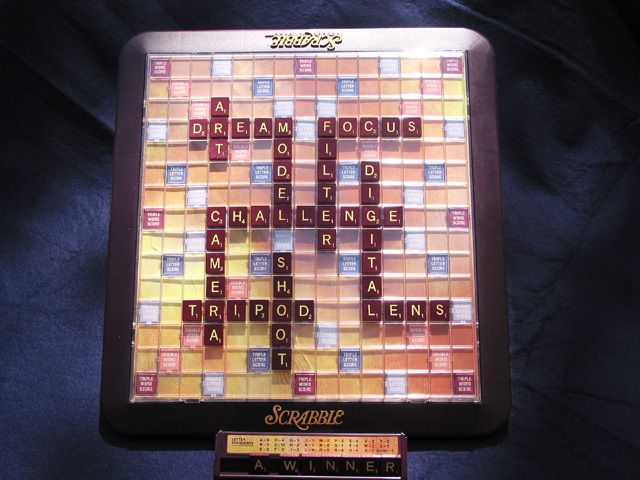
| Lighting could use work -- it's a bit too bright at the top. |
|
|
|
05/26/2002 01:40:00 AM |
|
|
|
05/26/2002 12:06:00 AM |
| I'd rather see a real game. Too contrived for me. |
|
|
|
05/25/2002 07:34:00 PM |
| This is a good shot! Only problems I can see are that it seems to be too much light at the top, and your backdrop cloth should be smooth, try to iron it out a little. I like the way you have set up the game board |
|
|
|
05/25/2002 06:00:00 PM |
Do you ever write regular crossword puzzles?
I'm too tired to count, but did you get all of those words out of one set's worth of tiles? |
|
|
|
05/24/2002 09:57:00 PM |
| A little too staged for my taste .... the upper left corner is too hot |
|
|
|
05/23/2002 04:16:00 PM |
| Best of the scrabble style. Too bright of light - softer lighting would help. Level out the primary target for the frame. |
|
|
|
05/23/2002 11:57:00 AM |
| a touch too harse light, upper right board, not enough light on A WINNER. Photo 8 Creativity 7 Games 8 total 8 |
|
|
|
05/23/2002 05:06:00 AM |
| It's appealing because the photo makes you stop and want to read what's spelled out. Good spacing of the letters. -NBT |
|
|
|
05/22/2002 07:30:00 PM |
| creative it needed some lighting on the right hand side also |
|
|
|
05/22/2002 05:11:00 PM |
| Very nice, the lighting is to bright on the top. I couldn't tell you how to changet that, I had the same problem with my photo. I still like it. :) |
|
|
|
05/22/2002 02:16:00 PM |
|
|
|
05/22/2002 01:18:00 PM |
| I like scrabble! I think the lighting in this shot is a little harsh on the top side of the scrabble board... good job! |
|
|
|
05/22/2002 09:43:00 AM |
| Nice choice of words, very appropriate for this challenge. The letters on the tab are a little dark, and there is a hotspot in the top right of the board. I possible, I would try to shoot something like this with natural light, and see if that gets rid of it. |
|
|
|
05/21/2002 07:26:00 PM |
| Nice photo - the words are well chosen and laid out clearly - it made me read each word. Perhaps the lighting is a bit harsh at the top of the board and a little dark on the "a winner" rack. A small amount of fill lighting would have helped there. |
|
|
|
05/21/2002 06:20:00 PM |
|
|
|
05/21/2002 03:50:00 PM |
| Lighting is pretty harsh at the top.....I like that you took the time to spell out so many photography words.......:) |
|
|
|
05/20/2002 07:13:00 PM |
| A nice shot, but would be much better if the wrinkles in the backdrop were removed, maybe do some heavy softening in photoshop. There are also some bad blowouts in the rear, especially toward the right side. |
|
|
|
05/20/2002 04:05:00 PM |
| The plastic board really reflects the light on top.A difuser of some sort would have helped. |
|
|
|
05/20/2002 01:31:00 PM |
| love the words but lighting is not so good. top is a little too bright |
|
|
|
05/20/2002 01:26:00 PM |
| "A WINNER"......subtle :) I like this very much, with the top of the board was just as clear as the bottom though - to bright I think, not sure. good job. |
|
|
|
05/20/2002 11:03:00 AM |
| Creative idea. By moving in on this shot tighter it would of had more interest and scored higher. |
|
|
|
05/20/2002 10:52:00 AM |
| the glare on the top is distracting |
|
|
|
05/20/2002 10:08:00 AM |
| Pretty nice product shot... Don't like how the tile holder is right on the bottom edge of the pic though... Should have left some space.. Lighting is a bit harsh up top. |
|
|
|
05/20/2002 03:25:00 AM |
| I really like this photo except for the shadows! Different lighting please. |
|
Home -
Challenges -
Community -
League -
Photos -
Cameras -
Lenses -
Learn -
Help -
Terms of Use -
Privacy -
Top ^
DPChallenge, and website content and design, Copyright © 2001-2025 Challenging Technologies, LLC.
All digital photo copyrights belong to the photographers and may not be used without permission.
Current Server Time: 03/12/2025 07:05:08 PM EDT.