| Author | Thread |
Comments Made During the Challenge  |
|
|
05/17/2005 10:56:16 PM |
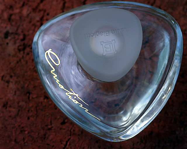
| Great shot, but you should have had the stopper turned. |
|
 Photographer found comment helpful. Photographer found comment helpful. |
|
|
05/17/2005 04:22:44 PM |
| Hmmm - the thumbnail for this photo certainly doesn't do it justice. Very nice lighting to get such clean looking glass. I wish the background was different however. The color and texture just don't appeal to me. And I wish the text on the lid was not upside down. |
|
| Photographer found comment helpful. |
|
|
05/17/2005 08:38:37 AM |
|
| Photographer found comment helpful. |
|
|
05/15/2005 07:30:47 PM |
|
|
|
05/15/2005 07:23:48 AM |
| Would have benefited from a bost of brightness and contrast levels. |
|
|
|
05/11/2005 05:18:53 PM |
| Beautiful advertising piece, could have worked in the jewelry challenge too. I love the isolation from the background and the lighting. If you could just have turned the top 180 degrees so the name could be read normally :-) ... |
|
| Photographer found comment helpful. |
|
|
05/11/2005 12:23:44 PM |
|
| Photographer found comment helpful. |
|
|
05/11/2005 09:48:56 AM |
| IMO u should've rotated the photo so that the writting was right side up |
|
|
|
05/11/2005 08:49:02 AM |
| nice color .nice DOF.......and even clear |
|
| Photographer found comment helpful. |
Home -
Challenges -
Community -
League -
Photos -
Cameras -
Lenses -
Learn -
Help -
Terms of Use -
Privacy -
Top ^
DPChallenge, and website content and design, Copyright © 2001-2025 Challenging Technologies, LLC.
All digital photo copyrights belong to the photographers and may not be used without permission.
Current Server Time: 04/29/2025 07:21:53 AM EDT.