| Author | Thread |
Comments Made During the Challenge  |
|
|
05/22/2005 06:47:57 PM |
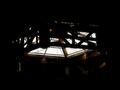
Concept: Nice Idea, but fails in the composition.
Composition: Backlit by what could be a monitor, replica buildings come off cheap and the background is not realistic. Centered subject here could work much better with a different crop-ratio or orientation.
Challenge: Not enough dark where there should be. Too much detail in the buildings. |
|
|
|
05/19/2005 11:29:08 AM |
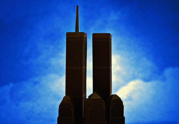
I'm not too keen on the background of this picture.
It doesn't looks crisp enough? |
|
|
|
05/19/2005 01:56:20 AM |
| The clouds look grainy and sort of artificial in this photo and centralizing the subjects gives it this snapshot feel, from another angle would have been better imo... |
|
|
|
05/18/2005 11:17:55 PM |
| A great color background for these towers. I would always be very careful when pushing colors. Always examine the image for artifacts of the breaking or interruption of natural tones. The sublety of a sky is much more than what a camera can grab, consequently when we push we limit more the natural tones. Better to see a less dramatic but natural sky. Still, the image remains impressive. 6 |
|
|
|
05/17/2005 04:20:53 PM |
| The sky is this picture seems over processed. |
|
|
|
05/17/2005 02:07:18 PM |
| post processing has left a halo effect around the subject. Just something to avoid in future submissions. |
|
|
|
05/17/2005 12:38:03 AM |
| Good composition and nice background. However, there is too much visible detail to truly call this a silhouette. Great model though! |
|
Home -
Challenges -
Community -
League -
Photos -
Cameras -
Lenses -
Learn -
Help -
Terms of Use -
Privacy -
Top ^
DPChallenge, and website content and design, Copyright © 2001-2025 Challenging Technologies, LLC.
All digital photo copyrights belong to the photographers and may not be used without permission.
Current Server Time: 03/17/2025 07:24:48 AM EDT.