| Author | Thread |
|
|
06/03/2005 12:23:32 PM |
*Critique Club*
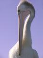
The first thing I noticed about this photo when it popped up on the screen was the left eyebrow (our right). I think it seems odd in the photo. Like it doesn't belong almost. Just kind of makes the photo look strange.
The second thing I notice and this is what my eyes keep going back to over and over again, is the texture in the background on the white side. I think that with a simplistic photo such as this, the texture kind of takes away the simplicity. It adds a distraction that also doesn't seem to belong in the photo. It clashes with the other half of the photo.
Focus and clarity are good. I like the detail in the face right down to the facial hair.
I like the lighting (other than the eyebrow) because of the simplicity. The negative space adds to the shot in my opinion and I think it works well.
So really, other than the eyebrow and the texture on the white side, this shot doesn't seem to need any other improvement in my eyes. Nicely set up and well done.
~Heather~ |
|
 Photographer found comment helpful. Photographer found comment helpful. |
Comments Made During the Challenge  |
|
|
05/26/2005 11:06:46 PM |
| I like the unusual dimensions for this shot. I like the fact that the mouth is cropped out as this is also unorthodox (and I imagine you'll probably catch some flak for it). I like the B/W/Sepia conversion. The only thing that bugs me at all is the light on his left eyebrow - not that there is light there, but that it makes such a hard, straight, horizontal line. Still, very well done. 7 |
|
| Photographer found comment helpful. |
|
|
05/26/2005 07:18:56 PM |
| all that negative space doesnt really help the photo. Its a valient effort, though the spot of the right eyebrow is a bit distracting, think it would have been better if it werent lit up. |
|
| Photographer found comment helpful. |
|
|
05/26/2005 04:19:54 PM |
|
| Photographer found comment helpful. |
|
|
05/26/2005 12:08:25 AM |
|
| Photographer found comment helpful. |
|
|
05/25/2005 11:06:02 PM |
|
| Photographer found comment helpful. |
|
|
05/25/2005 02:25:42 PM |
| light is the shot - wonderfully used! one of my favoirtes this challenge |
|
| Photographer found comment helpful. |
|
|
05/24/2005 11:16:18 PM |
| This would make a great print. Original expression of theme. |
|
| Photographer found comment helpful. |
|
|
05/24/2005 07:03:46 PM |
| Very creative. I love what you have done here. Amazing how you have created the tension in this one. Bravo. |
|
| Photographer found comment helpful. |
|
|
05/24/2005 01:56:17 PM |
| Don't believe anyone telling you otherwise .... this is VERY well done! 9. |
|
| Photographer found comment helpful. |
|
|
05/24/2005 10:05:53 AM |
| I like the idea very much - I wish the white space was whiter and there was a bit less black space. The straight black line under the subject's left eye is a little odd, but I erally like the hint of nostril visible on that side. Nicely done, would be excellent in my opinion with a little fine tuning. |
|
| Photographer found comment helpful. |
|
|
05/23/2005 10:04:19 AM |
| I love it,,,there is something about b&w that truly enhances some pics!! |
|
| Photographer found comment helpful. |
|
|
05/23/2005 08:54:20 AM |
| 8 I like the foucs of this shot. The shadow is perfect~ |
|
| Photographer found comment helpful. |
|
|
05/23/2005 07:20:44 AM |
|
| Photographer found comment helpful. |
Home -
Challenges -
Community -
League -
Photos -
Cameras -
Lenses -
Learn -
Help -
Terms of Use -
Privacy -
Top ^
DPChallenge, and website content and design, Copyright © 2001-2025 Challenging Technologies, LLC.
All digital photo copyrights belong to the photographers and may not be used without permission.
Current Server Time: 03/14/2025 09:26:18 AM EDT.