| Author | Thread |
|
|
04/23/2003 06:44:10 AM |
Critique Club:
Hi Yanik: This is one image I thought would do a lot better than 22nd. My pick was in the top three, but there is no accounting for voter's tastes right?
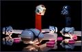
The first thing that hit me when I looked at this pic is the vivid deep red you've managed to bring out. It seems almost at the point of being oversaturated but it isn't, you've kept it just under the borderline. I am sure this took a lot of work with the setting up and the post processing to get it right.
The composition is excellent. I love the humor aspect you've created here. I gave this photo a 9, the reason I didn't give it the full 10 is because of the lighting which appears to be a little overdone at the top left and around the back left of the glass. It creates an uneven effect on the whole background.
Other than that this is a fantastic photo which was one of my 3 favourites for the week. Well done.
Gary |
|
 Photographer found comment helpful. Photographer found comment helpful. |
Comments Made During the Challenge  |
|
|
04/19/2003 02:12:48 PM |
| Vibrant and bold, this image works for me because there are few distractions. |
|
| Photographer found comment helpful. |
|
|
04/18/2003 06:01:56 AM |
| Good idea....but flares (reflections) on the subject and over-exposure on the upper lip. |
|
|
|
04/18/2003 04:31:07 AM |
| Good idea but the skin colour looks a bit odd. |
|
|
|
04/17/2003 06:41:56 PM |
| Cute idea. I like the lips and the red vine and most of the background, but I get the feeling that the upper left is "blown out". It shouldn't matter, but grabs my attention, so that can't be good. Still, it's an appealing shot overall. 8 Rob the Swash |
|
|
|
04/16/2003 09:33:20 PM |
| that's and interesting concept and design with the lines and shapes. although either your white balance or color processing has rendered the fleshtone a bit cold and grayish. not the most appealing because of that ... |
|
| Photographer found comment helpful. |
|
|
04/16/2003 12:59:06 PM |
| excellent shot.. i like the way the red really stands out strongly here... nice work :) - setzer |
|
| Photographer found comment helpful. |
|
|
04/15/2003 03:22:03 PM |
| One of my favorites of the week. |
|
|
|
04/15/2003 03:05:38 PM |
| Simple, clean, bright...GREAT concept. This is the best of all that I have seen! Way to go! Only 10 in the group! |
|
| Photographer found comment helpful. |
|
|
04/15/2003 12:06:12 PM |
| I like the high key of this shot. The lighting on the background if more even so as to be completely white would really make this photo jump off the page. I like your crop and composition. |
|
| Photographer found comment helpful. |
|
|
04/15/2003 12:35:21 AM |
| Perfect idea. Great color and lighting - good composition and wonderful leading line. My first (only?) 10. |
|
| Photographer found comment helpful. |
|
|
04/14/2003 10:46:42 PM |
| Nice shade of lipstick. It works here. |
|
|
|
04/14/2003 02:06:28 PM |
| neat idea. i wish her lipstick were darker to match the candy. |
|
|
|
04/14/2003 10:27:06 AM |
| Cute idea. Good composition. Light/bg are a little bit bright, but I think it's workn' here. |
|
| Photographer found comment helpful. |
|
|
04/14/2003 07:46:54 AM |
| I like this photo a lot. The deeps tones of red are very saturated and look good here, and of course I love the humor aspect. Good crop, good job - 9. |
|
| Photographer found comment helpful. |
|
|
04/14/2003 06:41:56 AM |
| Wonderful graphic impact. |
|
|
|
04/14/2003 04:52:05 AM |
| Good photo. Desaturating the other colors out really makes the licorice stand out for this pic. Great job. -8 |
|
| Photographer found comment helpful. |
|
|
04/14/2003 01:35:09 AM |
|
|
|
04/14/2003 12:49:26 AM |
| makes a mouth happy.......... |
|
Home -
Challenges -
Community -
League -
Photos -
Cameras -
Lenses -
Learn -
Help -
Terms of Use -
Privacy -
Top ^
DPChallenge, and website content and design, Copyright © 2001-2025 Challenging Technologies, LLC.
All digital photo copyrights belong to the photographers and may not be used without permission.
Current Server Time: 03/12/2025 04:12:02 PM EDT.