| Author | Thread |
Comments Made During the Challenge  |
|
|
06/07/2005 09:17:21 PM |
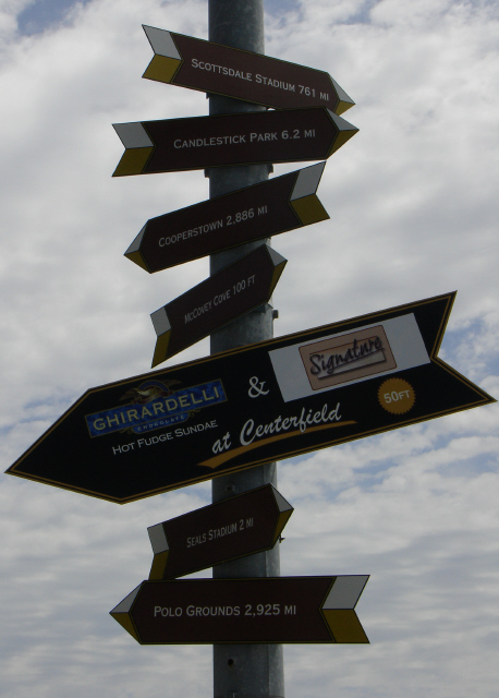
| Fun, definately the chocolate! |
|
|
|
06/07/2005 02:11:33 PM |
|
|
|
06/07/2005 03:13:54 AM |
| Good idea - the sky is over-cloudy however and doesn't provide an interesting backdrop. |
|
|
|
06/06/2005 05:17:39 AM |
| Signs a little dark. Bonus points for a picture from the best park in baseball lol. |
|
|
|
06/06/2005 01:10:17 AM |
| Could have been lightened a little more, kind of dark. Brining out the white in the lettering would make it look better. |
|
|
|
06/04/2005 02:14:46 PM |
| its a bit dark, otherwise, i like it a lot |
|
|
|
06/04/2005 09:48:20 AM |
|
|
|
06/03/2005 09:32:35 AM |
| Your image is to dark, good idea though. |
|
|
|
06/02/2005 11:27:30 PM |
| People will probably complain this is too dark. There isn't much lighting on the signs, but we can read what they say and really that's all that matters. Catching this in early morning or later evening, when the sun angles in on them, would help with that problem. |
|
|
|
06/02/2005 05:26:43 AM |
|
|
|
06/02/2005 12:40:26 AM |
| I don't feel that the image conveys instantly recognizable decision. Very nice pic though. |
|
|
|
06/01/2005 08:46:55 PM |
| good decision. Needs more light. |
|
|
|
06/01/2005 06:50:16 PM |
| Like the shot but think it is underexposed |
|
|
|
06/01/2005 05:42:39 PM |
| Good idea, I just wish the subject was lit a bit better. It's hard to see what is on the signs, but the arrows pointed in many directions still gets the point across. MMMM.. chocolate. |
|
|
|
06/01/2005 05:22:41 PM |
| How to make it clear that c is the route to be taken? |
|
|
|
06/01/2005 03:19:37 PM |
|
|
|
06/01/2005 02:10:59 PM |
|
|
|
06/01/2005 12:14:31 PM |
| Nice picture. I feel it oucld be a bit brighter, though |
|
|
|
06/01/2005 10:05:29 AM |
| Nice entry. A bit dark though. |
|
|
|
06/01/2005 04:33:46 AM |
| very good catch, but a dark photo.. don't want but can't give good rating :( |
|
|
|
06/01/2005 12:58:37 AM |
A little fill flash would have heped.
A few more Giants victories would help, too... |
|
|
|
06/01/2005 12:18:04 AM |
| I like the idea, but the sign's kind of underexposed and hard to read. |
|
|
|
06/01/2005 12:15:30 AM |
| Good picture for the challenge. Clouds make a nice background. The subject is just a little too dark. |
|
Home -
Challenges -
Community -
League -
Photos -
Cameras -
Lenses -
Learn -
Help -
Terms of Use -
Privacy -
Top ^
DPChallenge, and website content and design, Copyright © 2001-2025 Challenging Technologies, LLC.
All digital photo copyrights belong to the photographers and may not be used without permission.
Current Server Time: 03/12/2025 02:52:01 AM EDT.