| Author | Thread |
Comments Made During the Challenge  |
|
|
06/21/2005 08:39:32 AM |
| Nice composition but too Photoshop'd. |
|
 Photographer found comment helpful. Photographer found comment helpful. |
|
|
06/19/2005 04:51:01 PM |
| I don't 'get' this picture, there is no-one left behind in the picture. The execution is rather poor in composition and the B&W conversion seems bad. On the whole it leaves a rather unattractive impression and does not convey any message or story convincingly. |
|
|
|
06/19/2005 12:43:01 AM |
| One of the few that actually met the challenge... |
|
| Photographer found comment helpful. |
|
|
06/18/2005 08:44:29 PM |
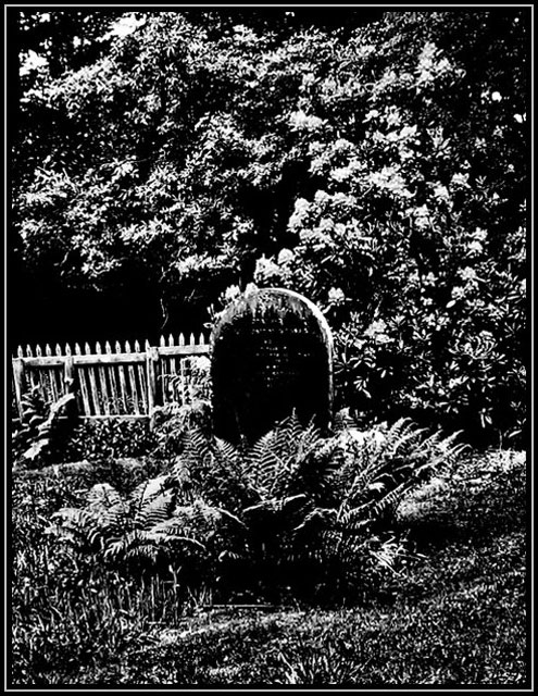
| I like the high contrast... except it might be too high because it flattens the image such that the focus (the stone) is washed out and overpowered by everything else around it. |
|
| Photographer found comment helpful. |
|
|
06/17/2005 05:30:04 PM |
| i don't think b&w was a good choice here. too busy. |
|
|
|
06/17/2005 11:10:23 AM |
| High contrast imaging is a good technique for this type of theme. Don't be surprised if some voters feel the technique was selected to mask what might otherwise be an average image. A ground level perspective with the tombstone looming above the viewer in the image would work well with a high contrast image like this. |
|
| Photographer found comment helpful. |
|
|
06/16/2005 10:43:33 PM |
This is one of the better shots for this challenge. I really like the 'negative' look here, and it works well for the challenge topic, and the content of your photo.
If there was anything I would improve on this it would to make the writing on the tombstone a little more visible. |
|
| Photographer found comment helpful. |
|
|
06/16/2005 08:02:22 PM |
| Love the processing used here. Only change I'd make is to crop a little more off the bottom. Like the border too! |
|
| Photographer found comment helpful. |
|
|
06/16/2005 07:26:53 PM |
| This looks oversaturated to me. The image of death meets the challenge. 5 |
|
| Photographer found comment helpful. |
|
|
06/16/2005 12:08:45 AM |
| there are hardly any grays in this pic. i must assume that's what you were going for, but it's not so appealing for me. i would have liked to make out a bit more of the tombstone. |
|
| Photographer found comment helpful. |
|
|
06/15/2005 05:34:30 PM |
| no detail, too much contrast or something...good idea though |
|
| Photographer found comment helpful. |
|
|
06/15/2005 10:51:36 AM |
| Picture looks very old...nice contrast |
|
| Photographer found comment helpful. |
|
|
06/15/2005 09:45:45 AM |
| This is a bit more contrasty than I like - gives me a headache if I look at it too long. You might also try cropping a bit moe of the foreground to emphasize the more dramatic aspects of the image. |
|
| Photographer found comment helpful. |
|
|
06/15/2005 04:47:56 AM |
| Oversharpened and too much contrast. |
|
Home -
Challenges -
Community -
League -
Photos -
Cameras -
Lenses -
Learn -
Help -
Terms of Use -
Privacy -
Top ^
DPChallenge, and website content and design, Copyright © 2001-2025 Challenging Technologies, LLC.
All digital photo copyrights belong to the photographers and may not be used without permission.
Current Server Time: 03/12/2025 09:44:58 AM EDT.