| Author | Thread |
Comments Made During the Challenge  |
|
|
06/21/2005 11:22:58 PM |
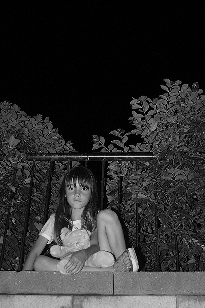
| Doesn't demonstrate darkness. Maybe more granularity and the detatchment of the child from the teddy bear may have improved the effect. |
|
 Photographer found comment helpful. Photographer found comment helpful. |
|
|
06/20/2005 09:57:42 AM |
Excellent clarity in the fine detail and a good capture of the child's expression. Great tones and B&W works well in this situation.
Most voters will likely "get it" but some may just think it is another kid picture.
You might consider cropping it closer on the child to highlight her. She is the main subject and much that is around her adds little to the composition.
Looks like the lines of the bricks and the top of the fence are slightly off horizontal by a third to a half a degree. In that situation you should rotate the image to make them perfectly level. |
|
| Photographer found comment helpful. |
|
|
06/17/2005 11:42:41 PM |
| fantastic!!!.....Good Luck |
|
| Photographer found comment helpful. |
|
|
06/16/2005 10:32:50 PM |
| I believe you could crop the top off to the top of the bushes and still have the same effect. |
|
| Photographer found comment helpful. |
|
|
06/16/2005 04:13:40 PM |
| I like your model......great expression on her face |
|
| Photographer found comment helpful. |
|
|
06/16/2005 12:22:30 AM |
| i would have liked more cropping on the top...IMHO. |
|
| Photographer found comment helpful. |
|
|
06/15/2005 06:45:36 PM |
| nice focus. You could have dressed her in shabby clothes and made her look homeless. that would have really driven the point home. The Flash was a bad call, a street light would have looked more convincing. Black and white was great call. I gave you a 6. |
|
| Photographer found comment helpful. |
|
|
06/15/2005 03:05:31 PM |
| Meets challenge very well. Photo lacks something, though, in order to be more interesting...maybe needs better lighting. 5 |
|
| Photographer found comment helpful. |
Home -
Challenges -
Community -
League -
Photos -
Cameras -
Lenses -
Learn -
Help -
Terms of Use -
Privacy -
Top ^
DPChallenge, and website content and design, Copyright © 2001-2025 Challenging Technologies, LLC.
All digital photo copyrights belong to the photographers and may not be used without permission.
Current Server Time: 03/12/2025 02:57:54 AM EDT.