| Author | Thread |
Comments Made During the Challenge  |
|
|
06/21/2005 11:23:44 PM |
|
 Photographer found comment helpful. Photographer found comment helpful. |
|
|
06/21/2005 11:18:08 PM |
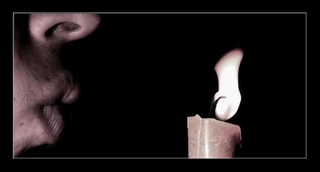
| Would be been perfect if you'd got it just as it went out....with that puff of smoke that comes up. |
|
| Photographer found comment helpful. |
|
|
06/21/2005 02:35:11 PM |
|
| Photographer found comment helpful. |
|
|
06/20/2005 08:57:55 AM |
| Fascinating concept you've captured for this challenge. The perspective and the composition is terrific. Technical quality is excellent. This will finish near the top in voting. |
|
| Photographer found comment helpful. |
|
|
06/19/2005 08:16:58 PM |
| Maybe try it without the nose in the shot? Interesting idea. |
|
| Photographer found comment helpful. |
|
|
06/19/2005 12:37:40 AM |
| One of the few that actually met the challenge... |
|
| Photographer found comment helpful. |
|
|
06/17/2005 01:33:59 AM |
Nice concept. The actual photograph becomes too small after removing the frame.
|
|
| Photographer found comment helpful. |
|
|
06/16/2005 08:32:29 PM |
Base score 5
Great Light/comp/proc +2
Top Five Photo in this challenge +1
Total score 8
Great photo...I thought of this when I saw the challenge...I'm glad I didn't try it, because you nailed it...a little more whip in the flame from the blow and this would be a perfect shot... |
|
| Photographer found comment helpful. |
|
|
06/16/2005 06:50:16 PM |
| empending darkness. This is definatly one of the more clever uses of light to represent darkness in this challenge. Was there a light source other than the candle? where the light is falling doesn't seem to be quiteright, but i might just be nuts. Excellent crop and you really captured the bend of the flame from the blast of breathe well. |
|
| Photographer found comment helpful. |
|
|
06/16/2005 01:37:50 AM |
| This is a good image which also meets the challenge well. For me though, the frame is too large, especially since all that remains at the top are nostrils. Nice sepia toning and good sharpness on the guy. |
|
| Photographer found comment helpful. |
|
|
06/16/2005 12:22:05 AM |
| a nice variation on the candle theme. |
|
| Photographer found comment helpful. |
|
|
06/15/2005 07:17:25 PM |
| like the photo hate the frame. |
|
| Photographer found comment helpful. |
|
|
06/15/2005 06:09:33 PM |
| great idea, but the crop leaves something to be desired. The large nostril in the top of the frame would have been better cropped out. |
|
| Photographer found comment helpful. |
|
|
06/15/2005 05:39:41 PM |
|
| Photographer found comment helpful. |
|
|
06/15/2005 02:58:26 PM |
| I like the idea of this shot. The candle is great, as is the movement of the flame. However, the face loses something for me. I think perhaps if the slope of the nose showed more so that it didn't seem cut off, it would have been less distracting. As it is, my eye tends to be drawn toward the nostril rather than the overall photo. Again, great idea. |
|
| Photographer found comment helpful. |
|
|
06/15/2005 01:35:42 PM |
|
| Photographer found comment helpful. |
|
|
06/15/2005 09:51:14 AM |
| nice photo. border is a bit thick for my taste. for me this would have been better if just the lips were seen blowing out the candle. good luck 8 |
|
| Photographer found comment helpful. |
Home -
Challenges -
Community -
League -
Photos -
Cameras -
Lenses -
Learn -
Help -
Terms of Use -
Privacy -
Top ^
DPChallenge, and website content and design, Copyright © 2001-2025 Challenging Technologies, LLC.
All digital photo copyrights belong to the photographers and may not be used without permission.
Current Server Time: 03/12/2025 07:48:34 AM EDT.