| Author | Thread |
|
|
07/02/2005 02:35:23 PM |
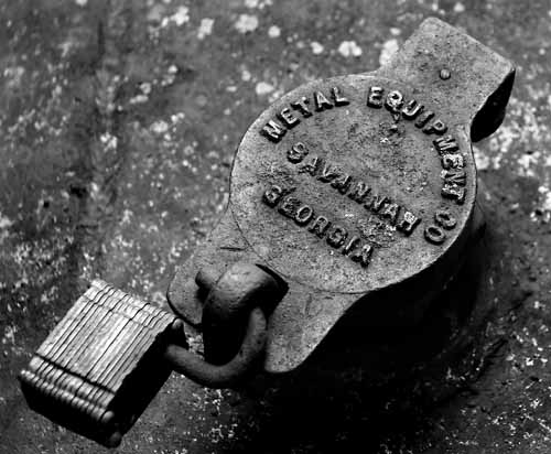
| Wayne - i gave a 6, but i think i was a bit stingy and you deserved a 7. The lock lent itself well to black and whte, for the most part the image is crisp and clear. Nice texture, nice composition. That the padlock doesnt seem to be crisp bothers my eye a little - did it move sligtly? With a f6.3 it shuldnt have been out of focus due to dof. That was my one little nitpick. The company name (and of course you titles it the Whole company name :p) added that little personal touch that i like to see in photos. Overall a very good entry for the metalchallenge. |
|
 Photographer found comment helpful. Photographer found comment helpful. |
Comments Made During the Challenge  |
|
|
06/23/2005 09:20:59 PM |
We all know that this is a metal challenge. Excluding the word "metal" would reflect a differant perspective, and strengthen the title.
NIce comp, blacks nice, whites need work bad, nice texture, good light, nice pix |
|
| Photographer found comment helpful. |
|
|
06/22/2005 04:49:53 PM |
| Nice textures and composition. |
|
| Photographer found comment helpful. |
|
|
06/22/2005 02:25:36 PM |
| Good subject, especially for grayscale. Just doesn't say a whole lot to me, though. |
|
| Photographer found comment helpful. |
|
|
06/22/2005 12:23:17 AM |
| I love this type of b&w! 9 |
|
| Photographer found comment helpful. |
Home -
Challenges -
Community -
League -
Photos -
Cameras -
Lenses -
Learn -
Help -
Terms of Use -
Privacy -
Top ^
DPChallenge, and website content and design, Copyright © 2001-2025 Challenging Technologies, LLC.
All digital photo copyrights belong to the photographers and may not be used without permission.
Current Server Time: 03/12/2025 02:38:46 PM EDT.