| Author | Thread |
|
|
10/17/2005 01:18:06 PM |
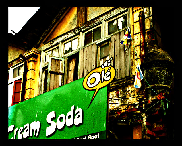
Just caught this in your portfolio and saw the related challenge theme. Can't believe how tremendously under-rated it was. I think this shot says so much: the obsolete old building and the values that go with it, to be replaced or overshadowed by a cheap-looking billboard and all the "non-values" that go with that ... Maybe I read too much into an image but I love images that seem to communicate something and if I even succeed just by half to do the same with mine, I'd be happy, which is not the case at the moment :(
|
|
 Photographer found comment helpful. Photographer found comment helpful. |
Comments Made During the Challenge  |
|
|
07/04/2005 05:26:36 PM |
A somewhat familiar taste to this photo.
Wonderful colors great contrast, marvelous texture... one of my favorites in this challenge! |
|
| Photographer found comment helpful. |
|
|
07/03/2005 11:17:12 AM |
The Cream Soda ad takes up a lot of the photo (because of its size & the strong solid color giving it lots of visual impact) - it almost becomes the subject of the photo (with the old building becoming an interesting background feature).
Like the post-processing, though. Extra points because of that! |
|
| Photographer found comment helpful. |
|
|
07/02/2005 12:38:26 AM |
| Post processing feels pretty harsh to me. Subtle is good. |
|
| Photographer found comment helpful. |
|
|
07/01/2005 05:06:38 PM |
| great colors... was an 8 at the beginning, but now after rating all the photos - it's a 9 :))) Yellow makes everything look right :) |
|
| Photographer found comment helpful. |
|
|
06/30/2005 10:59:05 AM |
| Nice grainy texture and hard colours. I like it. |
|
| Photographer found comment helpful. |
|
|
06/29/2005 03:15:41 PM |
|
| Photographer found comment helpful. |
|
|
06/29/2005 11:41:50 AM |
| nice effect..almost looks ike a cartoon to me...good luck |
|
| Photographer found comment helpful. |
|
|
06/29/2005 11:06:50 AM |
| I think I'm supposed to be looking at boarded up windows. but there's a giant lime green thing screaming for my attention. My first thought was the soda was obsolete - I like the post effect a lot, the composition is why I'm scoring this lower 4 |
|
| Photographer found comment helpful. |
|
|
06/29/2005 10:28:53 AM |
| What is obsolete in this image? |
|
| Photographer found comment helpful. |
|
|
06/29/2005 09:00:34 AM |
| I see the focal point of this image tobe the billboard. Billboards are not obsolete and the sign does not look forgotten or run down. I like it overall,but it does not fit this challenge IMHO. |
|
| Photographer found comment helpful. |
|
|
06/29/2005 06:43:27 AM |
| Great coloring! I like this picture and the contrasts in the subjects. |
|
| Photographer found comment helpful. |
Home -
Challenges -
Community -
League -
Photos -
Cameras -
Lenses -
Learn -
Help -
Terms of Use -
Privacy -
Top ^
DPChallenge, and website content and design, Copyright © 2001-2025 Challenging Technologies, LLC.
All digital photo copyrights belong to the photographers and may not be used without permission.
Current Server Time: 04/12/2025 04:17:09 AM EDT.