| Author | Thread |
|
|
07/10/2005 02:43:03 PM |
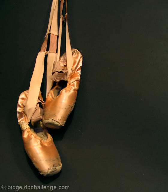
Pidge, i loved this image - and i felt for the poor toes that had worn these slippers to death. I'm sure many a painful session went into breaking them in, and now they are broken beyond repair.
I loved the composition and i did see your concept of hanging up the shoes.
The lower shoe seems to be just out of focus, and that did bother me just a little bit - personally i found myself thinking the left shoe is no more important than the right, so they should both be crisp.
Did you try the image in b&w? I just pulled it into photoshop (hope you dont mind) and desaturated it, then chose the hightlight on the heel of the left shoe as my white point and the background as my black and pulled the mid range up a bit, and the starkness of the image gives the image that extra impact of what once was and is no longer. With a sharper i meantioned, and this little waltz with curves, i would have given you a 10.
It was a wonderful, original image with very strong composition - with a like postprocessing you would have had a hole in one :) |
|
 Photographer found comment helpful. Photographer found comment helpful. |
|
|
07/07/2005 02:39:17 AM |
Very well said, Andy. This one was hard for me to judge. I gave it a 6, but that was from instinct. I couldn't put my finger on what was wrong. You captured it very well.
My only other comment is that the shoes seem to need some USM. I believe with sharper focus, and (do all the stuff Andy said), you'd have a stunning shot. |
|
| Photographer found comment helpful. |
|
|
07/07/2005 02:32:51 AM |
Excellent concept and a nice composition. IMO there are several things that may have brought your score up.
The first noticable (and I have been bitten by this before I started calibrating my monitor regularly) is the background. I believe it to be black velvet but it has been lightened to an almost dark gray. The negative space is fine but it really needed to be a lot darker to insure that there was nothing but the shoes to look at in the shot. The dull gray along with (another thing I have been bitten by which is lint/specks/cat hair) white specks on the backdrop tend to pop out when one really studies the shot. Both could be remedied by adjusting Luminosity upwards (darker) on the Histogram just to the point where the specks disappear. The other thing I learned is to have a lint brush handy as I have cats and they love black velvet.
The other thing that I would have done and this is even nit pickier...is that if the shoes are to appear dangling (and they do), I would have straightened the shot so that the shoes hung straight down...whether or not was straight as you took it, the human eye sees what it perceives to be right and in this case the shoes seem to be hanging to the left as I view it. Sometimes we need to adjust for the way eyes perceive things.
Subject matter is great and worked well here. The artsy side of me says this would have done exceptional with the same composition but done in a contrasty b/w to add even more age to the shoes.
Just my thoughts.
Message edited by author 2005-07-07 02:44:33. |
|
| Photographer found comment helpful. |
|
|
07/06/2005 07:31:40 AM |
| This is a great picture, wish I would have voted on it. |
|
| Photographer found comment helpful. |
|
|
07/06/2005 01:55:06 AM |
| I voted an 8 for this photo. DOF is good. I liked the poetry behind the image. I would have probably had the background a foot behind the shoes so that you couldn't see it. Great job. |
|
| Photographer found comment helpful. |
Comments Made During the Challenge  |
|
|
07/05/2005 05:06:10 PM |
| too bad you can see the background - these needed to hang in darkness |
|
| Photographer found comment helpful. |
|
|
07/05/2005 06:25:50 AM |
| well presented, nice lighting and nicely composed... |
|
| Photographer found comment helpful. |
|
|
07/04/2005 08:50:24 PM |
| okay, girls....who's been dancing on the pavement??? |
|
| Photographer found comment helpful. |
|
|
07/04/2005 12:55:57 AM |
| pretty good, nice color tinting. |
|
| Photographer found comment helpful. |
|
|
07/03/2005 12:15:28 PM |
| I like the dramatic lighting ... I think there is too much black empty space but, I don't find the rule of thirds always the most appealing and in this case I think the negative space is a negative. |
|
| Photographer found comment helpful. |
|
|
07/03/2005 01:20:47 AM |
|
| Photographer found comment helpful. |
|
|
07/02/2005 08:18:37 AM |
| I love it. One of my favorites in the challenge. |
|
| Photographer found comment helpful. |
|
|
07/02/2005 12:59:13 AM |
| Challenge relevance? Nice photo thought. |
|
| Photographer found comment helpful. |
|
|
06/30/2005 03:00:08 PM |
|
| Photographer found comment helpful. |
|
|
06/29/2005 09:15:29 PM |
| this is very sad to me, but at the same time filled with stories, effort and depth..much like wrinkles on an old person..great concept, the execution is nice but is not as great as what you are trying to say to me..8 |
|
| Photographer found comment helpful. |
|
|
06/29/2005 10:05:48 AM |
| Actually aren't these 'Toe Shoes'? |
|
| Photographer found comment helpful. |
Home -
Challenges -
Community -
League -
Photos -
Cameras -
Lenses -
Learn -
Help -
Terms of Use -
Privacy -
Top ^
DPChallenge, and website content and design, Copyright © 2001-2025 Challenging Technologies, LLC.
All digital photo copyrights belong to the photographers and may not be used without permission.
Current Server Time: 03/13/2025 08:27:55 PM EDT.