| Author | Thread |
|
|
05/11/2003 11:44:24 PM |
CRITIQUE CLUB CRITIQUE
by karmat
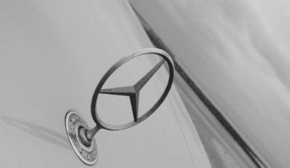
I like the dramatic angle you have chosen to present this with. It really adds interest to the shot, and makes it different. I also like that it is place in the lower left and in a sense, leads the viewer's eyes up and into the frame. I think the positioning of it gives a stable feeling to the picture, and a solid place to "rest the eyes."
To make it stronger, I think it may have been beneficial to either present it in color, or use more contrast in the bw. Right now, it is a muddled look to me, no distinct black or white, or even dark/light gray -- all of the grays are sort of in the middle of the spectrum. I think a crisply focused shot in color would have also had a nice effect.
Finally, the shot looks a little grainy to me. I understand this may be intentional sometimes, but I'm not sure it is truly effective here. Maybe a lower ISO would have eliminated some of that.
If you have questions or comments, please let me know. Best to you in future challenges! |
|
Comments Made During the Challenge  |
|
|
05/06/2003 06:04:23 PM |
|
|
|
05/06/2003 10:15:44 AM |
| very nice but not much to look at |
|
|
|
05/06/2003 10:08:32 AM |
| I wish the lord would buy me one too... |
|
|
|
05/05/2003 01:57:14 PM |
| by shooting this image at an angle i think you may have taken away from the end result, i may have taken it straight on to get a better effect, however, i like the idea 4 |
|
 Photographer found comment helpful. Photographer found comment helpful. |
|
|
05/05/2003 01:50:04 PM |
| the picture seems dusty. i also think the angle could be fixed. |
|
|
|
05/05/2003 01:50:01 PM |
| I like the use of black and white, but this image is too plain. Not to mention it is photographed at a strange angle. Maybe if you photographed more of the car, the picture would create more of a mood. |
|
| Photographer found comment helpful. |
|
|
05/04/2003 01:49:22 AM |
| My friend all drive Porsches..... |
|
|
|
05/03/2003 04:02:29 PM |
....Mercedes Benz. My friends all drive Porsche's, I must make amends....Janis Joplin.
unique approach. |
|
|
|
05/03/2003 07:00:30 AM |
| nice emblem, however I'd like to see more contrast and tones. Try playing around with the Levels functions in Photoshop or Histograms Adjustments in Paint Shop Pro. Jacko. |
|
|
|
05/01/2003 12:57:56 AM |
| Nice grain and perspective. The abstractness of this adds to the "allure" of what you've achieved here. It would have been nice to have the "star" a bit shinier, but that is a small criticism. Overall, high marks for this one. |
|
|
|
04/30/2003 10:20:09 AM |
beautiful done :)
I think the black and white works perfect here :) |
|
Home -
Challenges -
Community -
League -
Photos -
Cameras -
Lenses -
Learn -
Help -
Terms of Use -
Privacy -
Top ^
DPChallenge, and website content and design, Copyright © 2001-2025 Challenging Technologies, LLC.
All digital photo copyrights belong to the photographers and may not be used without permission.
Current Server Time: 03/12/2025 02:54:24 PM EDT.