| Author | Thread |
Comments Made During the Challenge  |
|
|
07/10/2005 04:08:36 PM |
|
 Photographer found comment helpful. Photographer found comment helpful. |
|
|
07/08/2005 08:15:13 PM |
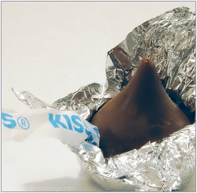
| Nice idea, but lighting is harsh and focus is soft. |
|
| Photographer found comment helpful. |
|
|
07/08/2005 05:23:57 PM |
| like it - think a little levels adjustment or fade correction would have made it pop just a little more from the background. 7 |
|
| Photographer found comment helpful. |
|
|
07/08/2005 10:20:35 AM |
Success! This makes me want chocolate real bad...
Very nice pic. I especially appreciate the full depth of field. |
|
| Photographer found comment helpful. |
|
|
07/07/2005 07:20:28 AM |
| Refreashing to see something other than a bug or a flower...and chocolate, no less. YUM. This is a very nice close-up and the picture is composed well. It just appears a tad flat. Perhaps a little level adjustment would give it more depth and pop. |
|
| Photographer found comment helpful. |
|
|
07/06/2005 05:01:09 PM |
| the color seems pretty washed out here. |
|
| Photographer found comment helpful. |
|
|
07/05/2005 04:07:37 PM |
| The background has a slight yellow hue to it. Perhaps a little bump in brightness would do the trick |
|
| Photographer found comment helpful. |
|
|
07/05/2005 02:11:33 PM |
| cool take on the challenge...a bit too grainy and out of focus. |
|
| Photographer found comment helpful. |
|
|
07/05/2005 02:15:11 AM |
| Good detail on this shot, and definitely nice and close. I feel like the colors in the shot are a little bit flat. Not sure if that's due to lighting or what. But I feel like if the blue on the wrapper was brighter and the color of the chocolate stood out a bit more, this photo would really pop. I like the composition a lot, with the chocolate over to the side. |
|
| Photographer found comment helpful. |
|
|
07/04/2005 10:22:22 PM |
|
| Photographer found comment helpful. |
|
|
07/04/2005 01:12:15 PM |
Pretty good idea, the highlights started to blow out in some areas.
I little more work with your lighting would help the chocolate look more natural as well ( a softbox or diffuser placed just inches over the top with the light close as well often gives me good results) |
|
| Photographer found comment helpful. |
|
|
07/04/2005 12:11:11 PM |
| The candy looks dull - like it's been in the frig - maybe I'm the only chocoholic who would notice that. Good detailing and composition. |
|
| Photographer found comment helpful. |
|
|
07/04/2005 11:29:10 AM |
| I love this one!! The tin foil really adds to the macro element, and the huge lettering on the Kiss tag. But it's a very pleasing photo to look at. No hairy bugs eyes here :) Great job. |
|
| Photographer found comment helpful. |
|
|
07/04/2005 10:07:04 AM |
Base: 5
Tech: +1
Subj:+2
Chln:
Total: 8
Yum |
|
| Photographer found comment helpful. |
|
|
07/04/2005 09:38:32 AM |
| Nice idea, but the contrast looks to be too high... Could be a really nice shot. 5 |
|
| Photographer found comment helpful. |
|
|
07/04/2005 12:51:37 AM |
| It is really nice to see something other than a bug or flower...the only thing that bothers me slightly about this image is the lighting...it seems very flat...perhaps it's the white background adding to this? I keep wanting to see more light and shadow play. |
|
| Photographer found comment helpful. |
|
|
07/04/2005 12:50:07 AM |
| hurts my eyes...foil is too shiny |
|
| Photographer found comment helpful. |
Home -
Challenges -
Community -
League -
Photos -
Cameras -
Lenses -
Learn -
Help -
Terms of Use -
Privacy -
Top ^
DPChallenge, and website content and design, Copyright © 2001-2025 Challenging Technologies, LLC.
All digital photo copyrights belong to the photographers and may not be used without permission.
Current Server Time: 03/12/2025 07:33:11 PM EDT.