| Author | Thread |
|
|
05/09/2003 11:39:29 PM |
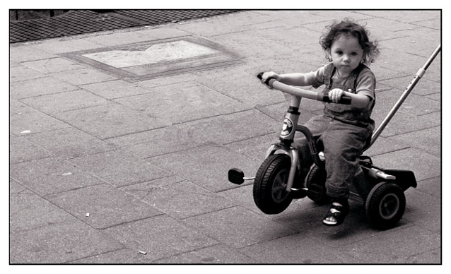
OK, first I must say I'm really glad to have this picture to critique because I like it a lot. :)
Let's talk of the subject first. I like the distance you took towards the theme picturing this child. She (he?) is definitely being transported, but this is not the typical pic you would expect for the transportation theme. Kudos for choosing an original subject, I like that a lot.
Technically I don't see too much to improve. The composition is great: not to show the parent behind was mandatory for this picture to work. The angle is good too. To kneel down would have been a mistake when the subject was this child being transported. I also like the negative space on the left. This is important to convey the idea of transportation. Once again, vey well done.
About the child's expression, it is perfect. She (he) doesn't seem to care a lot, this child seems more interested about what's going on around. Goes perfectly with the general idea of this pic, this child is being transported no matter what.
About the choice of black and white, I think it is a good move since the color definitely doesn't add anything to the idea you wanted to convey.
Another shot I'm so sorry to see so low on the votes...
Congratulations, this is a great shot. Don't believe your score... :)
The Critique Club
|
|
 Photographer found comment helpful. Photographer found comment helpful. |
|
|
05/07/2003 12:44:21 PM |
| I agree with mag -- this is severely underranked. |
|
| Photographer found comment helpful. |
|
|
05/07/2003 07:52:54 AM |
| hmm.. i really liked this one .. |
|
| Photographer found comment helpful. |
Comments Made During the Challenge  |
|
|
05/06/2003 02:45:42 PM |
| i like this shot for the expression on the kid's face! lol it's all attitude! I am amused by the pole in the shot too to get the little trike to "pop a wheelie" ;) There is too much "nothing" to the left in my opinion, so I might have cropped a little more on that side to put more attention on our little hell's angel. :) |
|
| Photographer found comment helpful. |
|
|
05/05/2003 01:48:51 PM |
| i like how you used black and white for the photo. Good Job. Nice Pic |
|
| Photographer found comment helpful. |
|
|
05/03/2003 06:58:43 AM |
| Very cute. Good job on chosing B&W... nice tones and contrast. Jacko. 8 |
|
| Photographer found comment helpful. |
|
|
05/02/2003 05:30:27 PM |
| good tones, the handle leaving the picture is distracting. |
|
|
|
05/02/2003 02:10:43 PM |
| An adorable child. Just riding easy - with little feet dangling. The photo looks blue - would it be better with all the color taken out? |
|
|
|
05/02/2003 10:16:04 AM |
| very nice work, the black and white makes the picture look great. i like your choice of subject, it make the image very cute. I like the fact that she is not smiling, it jus make the image better because it not so cliche'. Good job 9 |
|
| Photographer found comment helpful. |
|
|
05/01/2003 08:38:16 PM |
|
|
|
05/01/2003 02:22:29 PM |
| She doesn`t look to happy with you. Looks like something has been cloned out above her right hand but it`s probaly just the pattern of the path. |
|
|
|
04/30/2003 10:51:05 AM |
| this is simply cute :) The look on her face.. the composition... the toning... beautiful shot :) = 10 - setzler |
|
| Photographer found comment helpful. |
|
|
04/30/2003 08:54:58 AM |
| nice, what's that bar behind the rider? |
|
|
|
04/30/2003 01:38:00 AM |
|
Home -
Challenges -
Community -
League -
Photos -
Cameras -
Lenses -
Learn -
Help -
Terms of Use -
Privacy -
Top ^
DPChallenge, and website content and design, Copyright © 2001-2025 Challenging Technologies, LLC.
All digital photo copyrights belong to the photographers and may not be used without permission.
Current Server Time: 03/12/2025 08:50:35 AM EDT.