| Author | Thread |
Comments Made During the Challenge  |
|
|
07/12/2005 08:31:13 PM |
|
|
|
07/10/2005 12:31:20 PM |
| Maybe take a picture of something that looks more... aesthetic maybe? Not saying that it might taste good but it's not the most beautiful dish i've seen in a while =D |
|
|
|
07/09/2005 03:14:15 PM |
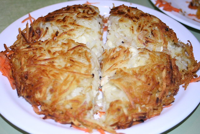
| Well, it's round. visually appealing? no. The plate in the back just really makes this look like a quick last minute entry to try to get 'something' in the challenge. At least take the time to clean up the surroundings for a shot that you're going to enter to compete in a challenge against others. The DOF has no apparent purpose here. The front part of the potato thingy is out of focus and blurry and that's the part of the photo I looked at first. The center, which is the least interesting part of the photo is in good focus, but nothing really to look at there. Definately fits the theme, circle thing on a circle plate. The centered composition doesn't work for this image in my opinion. Lacking something, maybe a dramatic angle or different crop. Definately sloppy background though. ~Heather~ |
|
 Photographer found comment helpful. Photographer found comment helpful. |
|
|
07/08/2005 12:09:58 AM |
It's a circle, all right, but I think there are several elements "wrong", in my opinion: (1) focus is on the rear of the photo, but the perspective makes the eye want to wander to the front, (2) The second plate is a distraction, (3) the table cloth is not a particularly appealing color, (4) the coloration/presentation/angle of the food is not particularly appealing.
All in all, I get the feeling this is a snapshot of something on a table, but I feel like a photo of food should include some level of pre-composition: back the shot out to include more table, arrange some attractive elements around the plate (fork, cloth napkin, glass), etc. |
|
| Photographer found comment helpful. |
|
|
07/07/2005 11:25:09 PM |
| This needs more DOF and some sort of garnish to make is stand out. |
|
|
|
07/07/2005 07:51:48 PM |
| I don't see much of a circle, I mean, it's there, but it's in half. the second plate takes away from the quality. Sorry. |
|
|
|
07/06/2005 01:57:38 PM |
| erm - colour balance is off, making this look unappetising. green/yellow cast is bad. subject not the best in any case. Needs DoF onad focus on details - not a good choice of subject to get a pretty circle out of, I thnk |
|
|
|
07/06/2005 12:03:30 PM |
| More DOF would have helped. Also the subject is not that interesting in my opinion. |
|
|
|
07/06/2005 05:51:59 AM |
| if only that other plate wasn't in the background, looks yummy |
|
|
|
07/06/2005 04:17:32 AM |
| perhaps more depth of field? |
|
Home -
Challenges -
Community -
League -
Photos -
Cameras -
Lenses -
Learn -
Help -
Terms of Use -
Privacy -
Top ^
DPChallenge, and website content and design, Copyright © 2001-2025 Challenging Technologies, LLC.
All digital photo copyrights belong to the photographers and may not be used without permission.
Current Server Time: 03/14/2025 01:34:49 AM EDT.