| Author | Thread |
|
|
05/15/2003 08:45:33 PM |
Greetings from the Critique Club :)
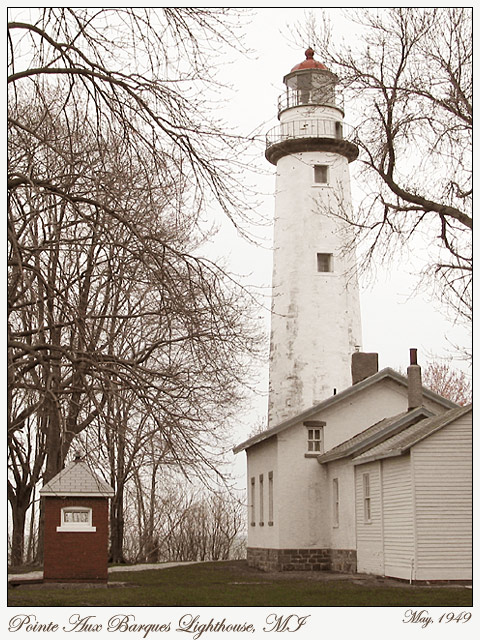
Hi Wes and welcome back... Glad to see you went out of your way to bring us this photo because it is simply beautiful. I think I caught onto your idea with the coloring with my original comment on this photo. You did an excellent job of capturing some by-gone era with the coloring. The weather was also beautiful for enhancing this theme. The grey sky works nicely with the bare trees that are just starting to bud with spring in the northern part of the US.
I think this photo is underrated. I don't know why it didn't score a lot higher. I actually think that the 'cheeze' factor of most postcards is quite stereotypical and the aggregate vote on the site probably is used to seeing things that way.
Excellent work... I wouldn't change a thing about it...
Keep up the good work and I look forward to seeing more...
John Setzler
|
|
 Photographer found comment helpful. Photographer found comment helpful. |
Comments Made During the Challenge  |
|
|
05/11/2003 11:05:56 PM |
| Nice shot and effect -- for some reason this image reminded me of the movie the Ring :-) |
|
| Photographer found comment helpful. |
|
|
05/10/2003 10:31:12 AM |
| beautiful! has an old fashioned hand colored look to it. nice perspective and i really like how the lighthouse is framed by the trees. good job! |
|
| Photographer found comment helpful. |
|
|
05/10/2003 01:59:49 AM |
|
| Photographer found comment helpful. |
|
|
05/08/2003 01:56:13 PM |
| I think I would have liked to see this lighthouse against a different coloured sky. Maybe if it were a sunnier day, rather than overcast, or even a sunrise or something, just to add more colour to it. The brightness of the sky has the effect of making everything not white seem very dark and colourless. |
|
| Photographer found comment helpful. |
|
|
05/08/2003 05:01:18 AM |
| Good old looking photograph. It really does have that '50s feel to it with the black and white/sepia look to it. It doesn't really seem like one o the other definitely. Nice balance to this photo with the framing but I think I'd like to see all of the building under the lighthouse. Good pic despite. |
|
| Photographer found comment helpful. |
|
|
05/08/2003 01:13:35 AM |
| Love the perspective - not fond of the colors. |
|
| Photographer found comment helpful. |
|
|
05/07/2003 11:18:45 AM |
| Great composition. The slightly washed-out effect makes it seem old. |
|
| Photographer found comment helpful. |
|
|
05/06/2003 10:17:13 PM |
| I think the sepia tone works great here as do the trees. I like the touch of red as well. Very unusual looking lighthouse. |
|
| Photographer found comment helpful. |
|
|
05/06/2003 08:20:23 PM |
| Very interesting landmark. The trees in front of the lighthouse really take away from the shot. Aside from taking a chainsaw to the trees, maybe look at using the branches to frame the lighthouse. Jacko. |
|
| Photographer found comment helpful. |
|
|
05/06/2003 10:38:42 AM |
|
| Photographer found comment helpful. |
|
|
05/06/2003 04:47:39 AM |
| I like the old-fashioned feeling you are creating with your postcard especially with the nostalgic kind of writing. The colors you have brought out also convey to me a sense of the past. Very good! |
|
| Photographer found comment helpful. |
|
|
05/06/2003 12:43:09 AM |
| Not a lot of contrasts here--it all seems the same tone throughout. But the composition is excellent, and I love how the trees frame the lighthouse. |
|
| Photographer found comment helpful. |
|
|
05/05/2003 07:51:50 PM |
| excellent shot... I love postcard scenes that don't have the strong 'cheezy touristy' factor to them. The subdued color on this one nicely enhances the 'old' theme... excellent work :) - setzler |
|
| Photographer found comment helpful. |
|
|
05/05/2003 06:50:54 PM |
| Very nice old feel to this one. The font is really great for this one. Good job! |
|
| Photographer found comment helpful. |
|
|
05/05/2003 05:57:29 PM |
| Text is a little hard to read. Overall picture would have been better with a blue sky or being that it is Michigan should i say a sky that is not so white... Good job. |
|
| Photographer found comment helpful. |
|
|
05/05/2003 02:37:22 PM |
| I don't get if the photo was taken in 1949 or the lighthouse was built then. I really like the mood it sets, and the red at the top coordinating visually with the red at the bottom. The muted colors work well for this image. |
|
| Photographer found comment helpful. |
|
|
05/05/2003 12:29:15 PM |
| Nice perspective, B%W would have done better here considering the lighting. |
|
| Photographer found comment helpful. |
Home -
Challenges -
Community -
League -
Photos -
Cameras -
Lenses -
Learn -
Help -
Terms of Use -
Privacy -
Top ^
DPChallenge, and website content and design, Copyright © 2001-2025 Challenging Technologies, LLC.
All digital photo copyrights belong to the photographers and may not be used without permission.
Current Server Time: 03/14/2025 07:38:59 PM EDT.