| Author | Thread |
Comments Made During the Challenge  |
|
|
05/11/2003 11:04:19 AM |
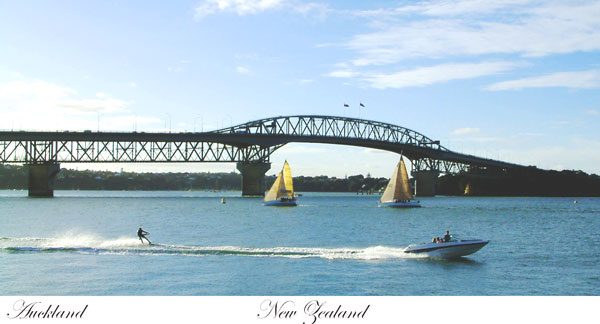
| Not a standard aspect ratio of cards. I'd have either put all the type in the center or on the two edges, but not mixed like this. Stacking the type in the center would give you a good excuse to increase the lower border and balance the size. |
|
|
|
05/08/2003 02:27:16 PM |
| Good postcardy choice of subject, good composition (eye is drawn to the bridge, then the sailboats, then the waterskier). I would have graded it 9 or 10 if it didn't seem quite so ... washed out. The entire left side of the sky is screaming bright featureless white, and the rest of it is a weird cyan sort of shade. A little more saturation, or less overall brightness maybe, would have brought out the colors better. |
|
|
|
05/06/2003 04:16:40 PM |
| Seems alittle less colorful. Was this intended? Nicely done anyway.7 |
|
|
|
05/06/2003 01:04:38 PM |
| Might think about having all the text together, it looks a little unbalanced. |
|
 Photographer found comment helpful. Photographer found comment helpful. |
|
|
05/05/2003 05:32:28 PM |
| nice shot. good capture of different elements in the photo, but i think the lighting and shadows (which was obviously not something you could do a whole lot about) reduces somewhat the overall effectiveness of the shot. |
|
| Photographer found comment helpful. |
|
|
05/05/2003 03:31:50 AM |
| I used to be in the Navy in Devonport so I know this bridge very well! Good capture and, yep, I'd buy this postcard! |
|
| Photographer found comment helpful. |
|
|
05/05/2003 12:57:40 AM |
| I like the dimmensions of this one. Very nice. I Also like the border being only on the bottom as it is. The text is very fitting and this would make a great postcard. It seems slightly overexposed or brightened a small bit too much but other than that it's a great image. |
|
| Photographer found comment helpful. |
Home -
Challenges -
Community -
League -
Photos -
Cameras -
Lenses -
Learn -
Help -
Terms of Use -
Privacy -
Top ^
DPChallenge, and website content and design, Copyright © 2001-2025 Challenging Technologies, LLC.
All digital photo copyrights belong to the photographers and may not be used without permission.
Current Server Time: 03/13/2025 11:27:27 AM EDT.