| Author | Thread |
|
|
05/19/2003 10:39:09 PM |
Critique Club
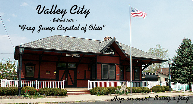
Composition: In general I really like the composition. The building is nicely placed, the flag (so important to American's it seems) is prominent, and there is a lovely piece of sky to enter the text over. I think the text in the lower right corner is hard to read and unnecessary though.
Technical Quality: The photo is fairly good from a technical standpoint. The building is a little dark from shadows though - depending on the orientation of the building perhaps shooting earlier in the morning or late afternoon would have produced less shadow. Also the text is a little soft, but this is probably a result of the image being reduced to <150kb and not your fault.
Meeting the challenge: It seems to be a nice postcard which is appropriate for "Valley City". The text in the top half is quite appropriate for a postcard.
Creativity: Presumably the depot is a landmark and a sense of pride for the community, and therefore an appropriate subject for a postcard. The shot itself isn't terribly creative, but I think it's appropriate for the mood you were seeking.
Overall: It's a good shot which struggles a bit from harsh lighting creative shadows on the main subject. Also the parallax type effect of the building becoming smaller towards the right was initially offputting but fine once I looked at the picture for a couple of minutes.
|
|
Comments Made During the Challenge  |
|
|
05/10/2003 10:58:18 PM |
| This has a nice 'old time' postcard feel. |
|
|
|
05/09/2003 04:16:53 PM |
| Love the captioning! :) The front building is a bit too shadowed, maybe shooting at a different time of day, or a different method of metering would have helped? |
|
|
|
05/08/2003 11:30:15 AM |
| Good composition, just the sort of postcard I would expect to find in Valley City although I've never been there :-) |
|
|
|
05/08/2003 12:02:53 AM |
| good composition but the sky is a touch washed.. try a polerizing and UV filter |
|
|
|
05/07/2003 05:21:41 AM |
| :-) I do hope this is an ironic entry ... it has all those crass elements of dodgy postcards down to a 't': just wonder how many people are going to agree with me. Too much text, pointless (even bizarre) message, excellently done. Really like this. |
|
 Photographer found comment helpful. Photographer found comment helpful. |
|
|
05/06/2003 08:07:27 PM |
| Nice perspective of the (train station?). nice use of test to fill the sky. I like it. Jacko. |
|
|
|
05/05/2003 10:29:48 AM |
| the hop on over got a grin from me - good entry. The phone lines on the left are irritating |
|
Home -
Challenges -
Community -
League -
Photos -
Cameras -
Lenses -
Learn -
Help -
Terms of Use -
Privacy -
Top ^
DPChallenge, and website content and design, Copyright © 2001-2025 Challenging Technologies, LLC.
All digital photo copyrights belong to the photographers and may not be used without permission.
Current Server Time: 03/14/2025 06:01:27 AM EDT.