| Author | Thread |
|
|
05/19/2003 11:52:50 AM |
John,
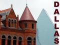
Thanks for your critique of my Brooklyn photograph. I felt my main problem with the photo was the perspective of the tops of the walls of the warehouse vs. the brooklyn bridge in the background, and the fact that the walls were brightly lit vs. the partially lit dark stone of the bridge. After the competition started it occured to me that maybe I should have framed it and in text at the bottom of the frame said 'Welcome from Brooklyn' or something like that.
As to having just taken a picture of the bridge, I've used it in 'leading lines' and 'bridges', and feel a regular shot of it is a bit cliche (and I didn't feel like waiting around for catching the bridge with the statue of liberty in the background at sunset ;-)
Cheers, Tom
Message edited by author 2003-05-19 11:53:27. |
|
|
|
05/16/2003 10:17:21 AM |
Greetings from the Critique Club :)
Hi Tom...
I like the architecture capture in this photo quite a bit... The brickwork and the lines and general composition are all excellent. The color looks a bit odd... possibly from a saturation bump, but not sure... A little extra contrast could help a bit I believe...
As for the postcard theme, I'm not so sure I like it. Postcards generally illustrate a site you would want to visit. I'm not saying that Brooklyn is not a good place to visit, but this particular spot doesn't particularly inspire me to make a trip to see it.
The bridge itself, on the other hand, would be a much more inpsiring scene on its own I believe. The architecture provided there lends itself very well to some interesting photos... I have seen this particular bridge photographed many times in many different ways... I think it's the GW bridge? Not exactly sure...
Keep up the good work :)
John Setzler
|
|
 Photographer found comment helpful. Photographer found comment helpful. |
Comments Made During the Challenge  |
|
|
05/10/2003 12:52:24 PM |
| Excellent picture! Filled with character and well executed. |
|
| Photographer found comment helpful. |
|
|
05/08/2003 02:18:26 AM |
| I like the original vantage point of this shot. If it weren't for that famous bridge no one would ever guess this is NYC. Great to leave the 'beaten path' for something as cliche as postcards. Triangles are one of my favorite shapes and i see a number of them hear; my eye dotes on them. 7 |
|
| Photographer found comment helpful. |
|
|
05/07/2003 04:03:02 PM |
| I love how you captured the bridge and this old build's beautiful archways in one shot. The contrast of the red brick against the cold stone and metal bridge and blue sky make for a very stunning composition. |
|
| Photographer found comment helpful. |
|
|
05/06/2003 06:08:09 AM |
| The structures contrast well against the blue sky. You have chosen an unusual perspective here but the title explains to me what you are getting at. Good deep DOF, everything is in focus, well done. |
|
| Photographer found comment helpful. |
|
|
05/05/2003 08:39:08 PM |
| Would have like to see text on the front of the card - a personal preference. Nice overall. |
|
| Photographer found comment helpful. |
|
|
05/05/2003 07:17:18 PM |
| cool perspective. a little overexposed |
|
| Photographer found comment helpful. |
|
|
05/05/2003 02:48:37 PM |
| Love the bridge framed in the arch! This is such a visually interesting image! |
|
| Photographer found comment helpful. |
Home -
Challenges -
Community -
League -
Photos -
Cameras -
Lenses -
Learn -
Help -
Terms of Use -
Privacy -
Top ^
DPChallenge, and website content and design, Copyright © 2001-2025 Challenging Technologies, LLC.
All digital photo copyrights belong to the photographers and may not be used without permission.
Current Server Time: 03/14/2025 09:24:08 AM EDT.