| Author | Thread |
|
|
05/18/2003 05:34:33 PM |
CRITIQUE CLUB CRITIQUE
by karmat
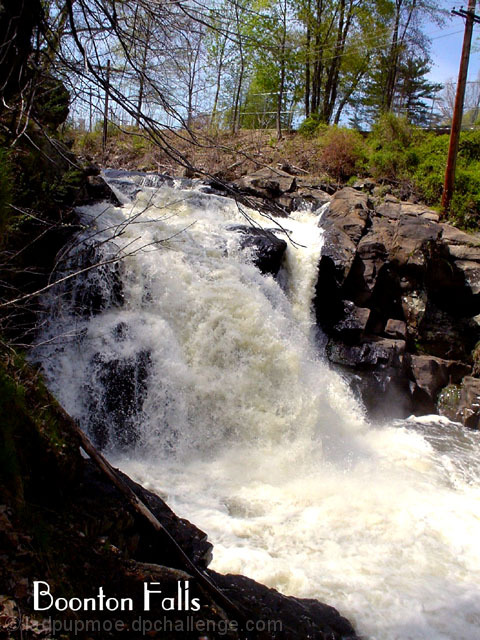
I really like the dramatic lighting in this. It helps to showcase the rocks and the rushing water well. It seems to be a touch overexposed on the water, but just a touch.I also like the vivid colors of the green around as well. The composition is effective in that the falls start going to the left then curves gracefully back to the right. This helps to lead the eye through the picture.
The telephone pole bothers me for several reasons, however. Since it is tilted, it gives the illusion that the entire shot is tilted because we associate poles with being vertical. Also, it gives the shot the feeling that this is a small waterfall in the middle of town that is rushing because of recent rain, or something. The pole just makes me think of a more populated section. If you could have framed so that the pole was not there, or cropped it out, I think it would have been more effective.
I don't know what settings you used, or if they could have been controlled, but if you could have used a slow shutter speed, and gotten a "smooth" looking waterfall, that would have been almost poetic, I think.
If you have any questions or comments please feel free to PM me!
Best to you in future challenges.
karmat |
|
 Photographer found comment helpful. Photographer found comment helpful. |
Comments Made During the Challenge  |
|
|
05/11/2003 02:35:01 PM |
| I think you could crop the right a little to take out the pole and not lose too much of the falls. |
|
| Photographer found comment helpful. |
|
|
05/10/2003 10:20:27 PM |
|
| Photographer found comment helpful. |
|
|
05/07/2003 11:21:42 AM |
| The telephone pole takes something away from the picture. The white water is nice though. |
|
| Photographer found comment helpful. |
|
|
05/06/2003 10:46:27 AM |
You could have cropped out the pole. I live nearby.
|
|
| Photographer found comment helpful. |
|
|
05/06/2003 06:47:03 AM |
| This is a good nature shot, wild water and rocks; typical postcard. However, some of the naturalness of the photo is decreased by the inclusion of the power pole and lines in the background. Maybe it would have been impossible to take this shot without that background but I'm sure a slight change in your position could have excluded the powerpole on the right hand side. Other than that, a top image. |
|
| Photographer found comment helpful. |
|
|
05/06/2003 02:38:17 AM |
| The power line is a problem but then if this was a real postcard you would just edit it out. Maybe you could have shot this from the other side? |
|
| Photographer found comment helpful. |
|
|
05/06/2003 12:44:49 AM |
| Very nice shot of water. The text seems to add a sense of the area, as it is so stylized. Good composition. Lowering your point of view would eliminate the electric lines and pole. |
|
| Photographer found comment helpful. |
|
|
05/05/2003 07:30:52 PM |
| State? It's titled to the right also. The font is kinda nice however. |
|
| Photographer found comment helpful. |
|
|
05/05/2003 12:25:06 PM |
| Really wish you had used a ND filter on this. a "silk" waterfall here would be top notch. |
|
| Photographer found comment helpful. |
Home -
Challenges -
Community -
League -
Photos -
Cameras -
Lenses -
Learn -
Help -
Terms of Use -
Privacy -
Top ^
DPChallenge, and website content and design, Copyright © 2001-2025 Challenging Technologies, LLC.
All digital photo copyrights belong to the photographers and may not be used without permission.
Current Server Time: 03/12/2025 03:15:19 AM EDT.