| Author | Thread |
|
|
05/14/2003 11:50:11 AM |
From the Critique Club
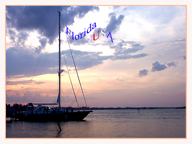
Hi Gracey,
First things first. I really like your "username". OK, that's out of the way, and I'll get to the picture next.
First impressions: The two things that most caught my attention in this entry are the beautiful, soft, almost pastel colours, and the text as flag.
Light: The light really is beautiful, probably the best part of the picture. I am not sure if the peach/pink/white border helps or detracts. I am wondering if as a postcard this picture would be more effective without a border, as you are stating your case already with the colours and the words, and the border doesn't really add much to that.
Focus: Could be better. You seem to have focused on the clouds. I think the water and the boat need to be sharper.
Composition: I very much like the low horizon line in this photo. Works well here.
The flag: Neat idea - it jumps out at me, tells me, "This is an American photo", without imposing "Americaness". My nitpick about the text as flag is simply that the rest of the picture is so calm, and the flag is waving in the wind, but there is no wind.
Good shot, and keep up the good work! Take care,
Ursula I Abresch |
|
Comments Made During the Challenge  |
|
|
05/11/2003 12:18:29 AM |
| I love the text-as-flag. The images seems slightly grainy, and I can't really determine a purpose to it. Lovely composition. Nice sky capture, too. |
|
|
|
05/10/2003 09:58:53 PM |
| I love your imaginative use of the text, good work |
|
|
|
05/08/2003 09:03:56 AM |
| A wonderful sunset (sunrise?) photo. You really caught the light at the correct moment. You've depicted the coldness of the sky at the top of the image transforming into the warmth of the sunlit clouds as you go down. I like it. The text flow and positioning doesn't really do much for me though. |
|
|
|
05/07/2003 01:16:35 PM |
| Interesting choice for the text. Unique. |
|
|
|
05/06/2003 04:27:59 PM |
Not too crazy about the font here but the is nice. Alittle grainey. 6
|
|
|
|
05/06/2003 12:39:46 PM |
| Nice text, but does the photo "say" florida? Could be almost anywhere, |
|
|
|
05/06/2003 05:31:04 AM |
| Hey, that's really cool; it looks like a flag. If only the whole thing were a bit sharper. |
|
|
|
05/05/2003 05:47:27 PM |
| you might have framed the text inside a 'flag', but still its neatly done, and nice image too! i think you might have been able to manipulate things to bring out the sunset's colors even more. |
|
|
|
05/05/2003 12:13:36 PM |
| The fake flag is a bit cheesy, but I like the sunset and the boat. The border complements the photo nicely. |
|
|
|
05/05/2003 12:12:00 AM |
| lots of noise in this photograph, but I like the composition and the colors. |
|
Home -
Challenges -
Community -
League -
Photos -
Cameras -
Lenses -
Learn -
Help -
Terms of Use -
Privacy -
Top ^
DPChallenge, and website content and design, Copyright © 2001-2025 Challenging Technologies, LLC.
All digital photo copyrights belong to the photographers and may not be used without permission.
Current Server Time: 04/28/2025 09:20:58 AM EDT.