| Author | Thread |
Comments Made During the Challenge  |
|
|
05/10/2003 09:57:12 PM |
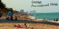
| This would be a nice postcard |
|
|
|
05/09/2003 01:51:51 PM |
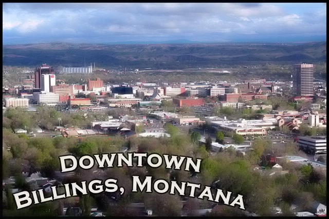
| ...and I always just thought that Billings was a big trailer park! Just kidding. Nice shot, esecially how you show Billings to be in its environment fo mountians and big sky. |
|
 Photographer found comment helpful. Photographer found comment helpful. |
|
|
05/09/2003 04:18:58 AM |
| What is interesting about this postcard is the layering effect. You got 4 layers: sky, hills, town, trees which makes for a good composition. |
|
| Photographer found comment helpful. |
|
|
05/08/2003 02:25:21 PM |
| Not a bad try, but I had to mark it down a bit. The choice of angle is nicely postcardy, but no postcard would smudge its subject up with that much blur and fog. There's also really no main 'thing' to look at - no focal point. One of those tall buildings could have been the star, or the mountains, or the (very pretty!) clouds, but as it is, nothing is but the text, and that's just an odd choice to have made. |
|
| Photographer found comment helpful. |
|
|
05/07/2003 01:34:46 PM |
| The soft focus is a nice touch and the text makes excellent use of negative space. |
|
| Photographer found comment helpful. |
|
|
05/06/2003 05:52:12 AM |
| I feel I have to be brutally honest here and say that I really hate the text, although I do appreciate the attempt at originality. Also, it looks like you did some processing that made the trees really fuzzy and not natural-looking. I hope to visit Billings some day, but I'm afraid this postcard won't help draw me there. |
|
|
|
05/05/2003 07:06:11 PM |
| Has a 70's feel and look to it. Great job! 8. |
|
| Photographer found comment helpful. |
|
|
05/05/2003 05:54:25 PM |
| Maybe to center the text would have been more effective. Great picture. |
|
|
|
05/05/2003 01:42:23 PM |
| Beautiful picture of Billings (been there ... ). I can't decide whether or not I like the words - the font/outline almost seems to be too "dominant", although, postcards often have that characteristic. Good work! |
|
| Photographer found comment helpful. |
|
|
05/05/2003 09:20:39 AM |
| Text is too much. The focus seems a bit soft, but it may also be the haze. |
|
| Photographer found comment helpful. |
|
|
05/05/2003 12:31:14 AM |
| i like how you can see the horizon/mountains.. nice! |
|
| Photographer found comment helpful. |
Home -
Challenges -
Community -
League -
Photos -
Cameras -
Lenses -
Learn -
Help -
Terms of Use -
Privacy -
Top ^
DPChallenge, and website content and design, Copyright © 2001-2025 Challenging Technologies, LLC.
All digital photo copyrights belong to the photographers and may not be used without permission.
Current Server Time: 03/12/2025 09:38:16 AM EDT.