| Author | Thread |
|
|
05/22/2003 02:50:22 PM |
*Critique Club*
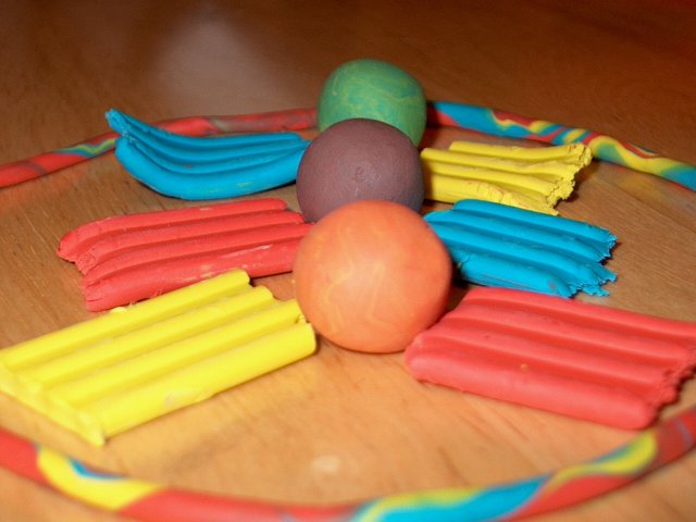
My eyes are first drawn to the balls here. I think because of the angled bricks of clay, they act almost like an arrow, pointing right at the balls.
I can see that you took a moment to set this up, however it does look sloppy. It looks like you simply ripped apart the primary colors and threw them on the table. this is most clear in the blue square in the upper left, and the yellow in the upper right. Had you even taken 2 seconds to smoothe them out so that they laid flat, that would have made this look like a bit more thought was put into it.
I honestly think this would work better in the secondary challenge. It seems like you have created a story. Blue and yellow make green. Red and blue make purple...etc. This story fits much better into secondary colors than primary colors.
The focus is ok, but I find the bit of out of focus ring to be distracting, as it is right there "in our face" so to speak.
The colors are ok. I've never tried to photograph clay before, so it could be a tricky texture, but I wonder if maybe different lighting would help the colors really punch.
The background is not good. I would have went with a solid color background. Probably white.
~Heather~
|
|
 Photographer found comment helpful. Photographer found comment helpful. |
Comments Made During the Challenge  |
|
|
05/18/2003 11:44:59 PM |
| The colors seem a bit flat to me. Were you using a flash? I think this could have been made stronger by placing it on a different background. Maybe a solid black or solid white. The would grain takes away from the color, I think, by adding another none primary/none secondary color. |
|
| Photographer found comment helpful. |
|
|
05/16/2003 05:30:08 PM |
| Its OK but I think you could have been more imaginative with the setup. |
|
|
|
05/15/2003 12:06:45 PM |
| The Playdoh (?)is a good idea for the primary color theme, but I think the photo itself would be a bit better if the elements in it were simpler in composition (just the big blocks of color, or the strand of combined colors, perhaps. There's a lot to look at in the photo, and my eye went right to the balls, possibly because the center of focus is really on the purple ball. The primary colors don't really come across clearly as the subject of the photo because of its complexity. |
|
| Photographer found comment helpful. |
|
|
05/15/2003 11:45:37 AM |
| Front of the ring is way too blurry - the challenge is primaries and while I see them on the sides leading to the secondaries, it's the balls that I see as the center of the shot. Good effort. |
|
| Photographer found comment helpful. |
|
|
05/14/2003 11:39:55 AM |
| The light of the flash is not very good to take good pictures, try it with natural light. Good luck |
|
| Photographer found comment helpful. |
|
|
05/13/2003 11:01:43 PM |
| I would like to see the front of the ring more and have that in focus. With the challenge being Primary Colors, I think having red, blue and yellow for the balls would have made it stronger. The balls seem the most important in the photo. 5 |
|
| Photographer found comment helpful. |
|
|
05/12/2003 10:03:28 AM |
| meets the challenge, but somewhat weak for me subjectively... some creative lighting could have been a nice improvement on this image... |
|
| Photographer found comment helpful. |
|
|
05/12/2003 04:13:35 AM |
|
Home -
Challenges -
Community -
League -
Photos -
Cameras -
Lenses -
Learn -
Help -
Terms of Use -
Privacy -
Top ^
DPChallenge, and website content and design, Copyright © 2001-2025 Challenging Technologies, LLC.
All digital photo copyrights belong to the photographers and may not be used without permission.
Current Server Time: 03/12/2025 01:39:15 PM EDT.