*Critique Club*
What can I say that could be of importance to someone who is great enough to have won 9 ribbons? My best answer to that would be, The Truth.
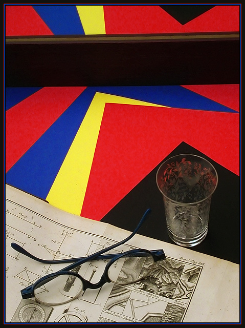
I don't really care for this image. It confuses me first off. I don't understand the relation of the paper, the glass and the blueprints.
There are a few things that really bother me the most. The first is that we cannot tell what the blueprints are for. I think that is what makes this confusing for me. What is the point? I know you put them there for a reason, but I'm not seeing the reason because I don't even know what it really is.
Secondly, you seperated this photo at the top for a reason with what I assume is a reflection. However, it's tilted. If you put this there on purpose, which I assume you did, I feel that it should be straightened up or removed. I think it's quite distracting.
Your focus and clarity seems good, and the primary colors really jump out of the shot. Lighting looks good, especially on the red blue and yellow papers. I think that is what makes it really punch.
One more thing, your border looks like it's suposed to be red and blue, however being so thin and so close together, it kind of blurrs in together makeing it appear a pinkish/purple color. Just something my eyes are doing automatically probably. ~Heather~
|