| Author | Thread |
Comments Made During the Challenge  |
|
|
06/09/2002 09:40:00 PM |
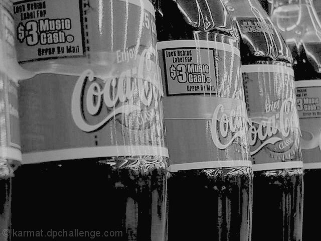
| think this is one where the colour version would work better to jump out in the red/ black |
|
 Photographer found comment helpful. Photographer found comment helpful. |
|
|
06/09/2002 02:24:00 PM |
| the advertisers of coke spend a lot of time to get the consumers attention with color. I dont think it works well in black & white |
|
| Photographer found comment helpful. |
|
|
06/08/2002 09:29:00 AM |
| I don't feel that black and white adds anything to this subject. This shot, in color, would probably have done quite well in the "red" challenge. |
|
| Photographer found comment helpful. |
|
|
06/07/2002 03:37:00 PM |
| nothing to shoot? While there's nothing really all that wrong with this photo, I can't really "get behind it". Photo 7 Creativity 4 B&W 5 total 5 |
|
| Photographer found comment helpful. |
|
|
06/05/2002 10:45:00 PM |
| This is a subject that really isn't helped by being black and white. That coca-cola bottle is really known for its red and you are subdueing it. Did you just take this at a supermarket? I think this could be a good picture in color and with a little better setup. For example, get rid of the $3 coupons, and the plastic holders. |
|
| Photographer found comment helpful. |
|
|
06/05/2002 06:45:00 PM |
| This is one I think I would have ignored the true highlights on and would have let them burn out a little further and go for the whites on the coke bottles as my base highlight. The angle on the bottles is a nice touch, adds a little interest to the shot. |
|
| Photographer found comment helpful. |
|
|
06/05/2002 03:16:00 PM |
| one of the few good subjects for challenge |
|
| Photographer found comment helpful. |
|
|
06/05/2002 10:20:00 AM |
| Seems uninspired and pretty snap shotty. It looks like you're going for symmetry here... maybe turn the bottles so all the labels are facing the same way or get a different angle to show more coke bottles. |
|
| Photographer found comment helpful. |
|
|
06/04/2002 12:08:00 PM |
| This image is lacking the contrast and excitement that the color version would have offered, so I don't feel you've used black & white to the advantage of the photo. If it had to be black and white, I'd probably push the lighter levels further towards light to increase the impact of the photo. It might also have been interesting to play with other focal points -- did you? |
|
| Photographer found comment helpful. |
|
|
06/04/2002 10:06:00 AM |
| well, gee that's original. Let me just take a shot of the coke bottles and convert it to black and white. Ugh. |
|
| Photographer found comment helpful. |
|
|
06/03/2002 03:59:00 PM |
| Creative idea and you did it well. I like this. Fine job. |
|
| Photographer found comment helpful. |
|
|
06/03/2002 03:26:00 PM |
| interesting view... The subject matter isn't grabbing me very much, but the composition is ok.... |
|
| Photographer found comment helpful. |
|
|
06/03/2002 07:33:00 AM |
| fun composition!! what makes it fun is that I can't tell if this is in a store or on an assembly line.. and I like the idea that I am looking into a bottling plant. fun!! |
|
| Photographer found comment helpful. |
|
|
06/03/2002 05:28:00 AM |
| Coke is my favourite drink, you have captured this shot well. Keep it up!! (8) |
|
| Photographer found comment helpful. |
|
|
06/03/2002 01:49:00 AM |
| This is a very crisp looking photograph, but lacking in good tonal range and detail. Too much contrast for my taste. |
|
| Photographer found comment helpful. |
Home -
Challenges -
Community -
League -
Photos -
Cameras -
Lenses -
Learn -
Help -
Terms of Use -
Privacy -
Top ^
DPChallenge, and website content and design, Copyright © 2001-2025 Challenging Technologies, LLC.
All digital photo copyrights belong to the photographers and may not be used without permission.
Current Server Time: 03/12/2025 11:42:55 AM EDT.