| Author | Thread |
|
|
05/19/2003 05:59:36 AM |
Zero 1s and three 2's! That's positive! Isn't lighting a pain?! :)
Keep plugging - we'll get there someday. |
|
Comments Made During the Challenge  |
|
|
05/18/2003 04:44:24 PM |
| Simple but effective, the background fits well! |
|
 Photographer found comment helpful. Photographer found comment helpful. |
|
|
05/16/2003 11:12:08 PM |
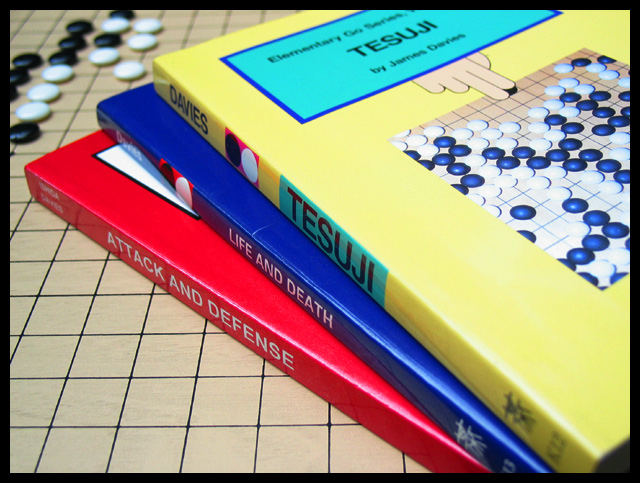
| I like the focus on this shot. The lighting is a bit too direct and washes out the pieces on the cover of the top book. The colors are present and accounted for (nice b/w in the background too). |
|
| Photographer found comment helpful. |
|
|
05/16/2003 08:06:17 PM |
| Interesting how they use primary colors for the book covers when the game itself is in black and white... |
|
| Photographer found comment helpful. |
|
|
05/13/2003 02:41:58 PM |
|
|
|
05/13/2003 10:25:13 AM |
| coulda been a contender with more interesting, directional lighting |
|
| Photographer found comment helpful. |
|
|
05/12/2003 11:21:01 AM |
| Nice composition, creative. |
|
| Photographer found comment helpful. |
Home -
Challenges -
Community -
League -
Photos -
Cameras -
Lenses -
Learn -
Help -
Terms of Use -
Privacy -
Top ^
DPChallenge, and website content and design, Copyright © 2001-2025 Challenging Technologies, LLC.
All digital photo copyrights belong to the photographers and may not be used without permission.
Current Server Time: 03/14/2025 03:37:11 PM EDT.