| Author | Thread |
Comments Made During the Challenge  |
|
|
06/09/2002 10:55:00 PM |
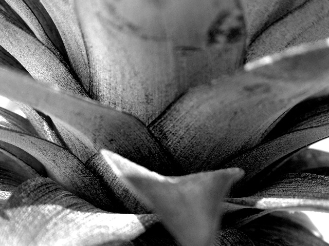
| the small DOF for this shot doesnt work very well with the leaves in the foreground, it's a bit distracting. |
|
|
|
06/09/2002 04:28:00 PM |
| Great textures and contrast. About the only suggestion I have to offer is that maybe a composition a less centered composition, one with the lower mostly out of focus leaf further in the lower right corner, would be something to try. |
|
|
|
06/09/2002 12:15:00 AM |
| You can feel the texture just looking at the photo. This is a very nice use of dark and light. |
|
|
|
06/07/2002 11:40:00 PM |
| nice contrast but didn't catch my eye |
|
|
|
06/07/2002 02:08:00 AM |
|
|
|
06/06/2002 11:47:00 PM |
| more light and more depth of field : ) |
|
|
|
06/06/2002 05:32:00 PM |
| needs more depth of field. Highlights blown out. |
|
|
|
06/06/2002 02:27:00 AM |
| good idea but i think this shot could have been better with a greater use os DOF as the out of focus areas are distracting from the shoot |
|
|
|
06/05/2002 01:41:00 PM |
| DOF is a bit too limited to make this work - central leaf is distracting. |
|
|
|
06/04/2002 04:25:00 PM |
| Not sure about the DoF. One out of focus leaf would have been OK, but I think four might be pushing it. Good job otherwise, though. |
|
|
|
06/04/2002 03:27:00 PM |
| Pushing the black point and what looks like a lot of sharpening makes it look like a carving/sculpture... |
|
|
|
06/04/2002 10:06:00 AM |
| Trying to figure out which part of this image should be in focus was probably a beast, so you'll certainly hate me when I say that I don't like the big, dominant leaf in the top middle so out of focus. Your use of contrast for texture is great. |
|
|
|
06/04/2002 05:33:00 AM |
| Good textures, sharpness (in the middle ground) and tones, but too many oof elements in the fg makes it hard for me to look at. The leaves at top, bottom, L & R seem to emerge from the frame in a way that makes me want to blink to avoid being poked in the eye. This effect can be useful, but I don't think it works here. |
|
|
|
06/04/2002 05:20:00 AM |
| Some great detail and shapes to look at here, but the depth of field is distracting. It doesn't really seem to add depth, it just creates a strange distortion. |
|
|
|
06/03/2002 03:45:00 PM |
|
|
|
06/03/2002 11:59:00 AM |
| You chose a place for the focus, but there is nothing there. This would have been better if it were full in focus. |
|
|
|
06/03/2002 10:11:00 AM |
| good contrast, very abstract in a way. |
|
|
|
06/03/2002 06:52:00 AM |
| This is a nice view, but a difficult one to get the good depth of field on... on a shot like this, I think it is easier to back away from the subject and use the zoom at it's highest potential to really get the best depth of field.... |
|
Home -
Challenges -
Community -
League -
Photos -
Cameras -
Lenses -
Learn -
Help -
Terms of Use -
Privacy -
Top ^
DPChallenge, and website content and design, Copyright © 2001-2025 Challenging Technologies, LLC.
All digital photo copyrights belong to the photographers and may not be used without permission.
Current Server Time: 03/12/2025 11:10:00 PM EDT.